Accessible Focus Indicators
Accounting for keyboard users is an imperative step towards ensuring that all users can easily navigate your website’s user interface. A keyboard user’s cursor equivalent is called a focus indicator. Unfortunately, not all websites feature accessible focus indicators. By designing and implementing accessible focus indicators, we can make our website more accessible to keyboard users and users of assistive technology.
According to the Web Content Accessibility Guidelines (WCAG), a focus indicator should satisfy the following requirements:
- The focus indicator should the visual presentation of the user interface component;
- The focus indicator should have a contrast ratio of at least 3:1 between its pixels in the focused and unfocused states;
- The focus indicator should have a contrast ratio of at least 3:1 against adjacent colors or should not be thinner than 2px.
By default, MUI uses a pulsing ripple effect when tabbing through UI elements. The pulsing ripple does not meet the accessibility requirements. In this section of the learning module, we will learn how to style the focus indicator of a number of MUI components to ensure that it meets the requirements outlined by the WCAG.
Navigation Buttons
We will start updating the custom buttons we created for the navigation bar to ensure that that they have accessible focus indicators.
Open the MacNavButton.tsx file located under the components/MacComponents directory and the following lines of code under both the MacNavButton and MacIconNavButton declarations:
"&:focus-visible": {
	outline: "2px solid #fff",
},
We defined the focus-visible pseudo-class to be a solid white outline that is 2px thick.
Next, we will need to define the focus-visible pseudo-class for active links in the navigation bar. Open the Navbar.module.css file in the styles directory and add the following lines of code to it:
.active:focus-visible {
    color: white;
    background: #707070;
    outline-color: #fdbf57;
}
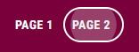
Save the file and go back to your browser. Try to tab through the navigation bar and notice the updated focus indicator.
Accessible Focus Indictor on MacNavButton | Accessible Focus Indicator on MacIconNavButton |
|---|---|
 |  |
The focus indicator on active links also adheres to the accessibility standards: 
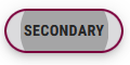
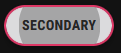
Buttons
We will now update the custom MacButton component that we created earlier with an accessible focus indicator.
Open the MacButton.tsx file located under the components/MacComponents directory and the following lines of code under MacButton declarations
"&:focus-visible": {
	color: useTheme().palette.mode === 'dark' ? (props.mainColor === 'primary' ? '#FFFFFF' : '') : '',
	backgroundColor:
		props.mainColor === 'secondary' ? '#DBDBDD' : '#5E6A71',
	outline: `2px solid ${useTheme().palette.mode === 'dark' ? (props.mainColor === 'primary' ? '#F4B7C7' : '#dd3765') : (props.mainColor === 'primary' ? 'black' : useTheme().palette.primary.main) }`,
},
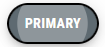
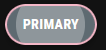
We determine the color of the focus indicator depending on the current theme (light/dark) and whether the button is a primary or secondary button. The chosen color of the outline has a contrast ratio that is equal to or greater than 3:1 with neighboring colors.
Focus Indictor on Primary MacButton | Focus Indicator on Secondary MacButton |
|---|---|
  |   |
Switches
We will start by adding a regular Switch component to “Page 1” to inspect the default focus indicator.
Open the app/page_1/page.tsx file and add the following import statement:
import {Switch} from "@mui/material";
Next, add the following lines after the </Box> closing tag:
<Box paddingLeft={5}>
    <Switch {...{ inputProps: { 'aria-label': 'Switch' } }} />
</Box>
Go back to your browser and try to tab through the switch component and notice how hard it is to see the focus indicator against a white background.

We will now create a custom MacSwitch component that has an accessible focus indicator.
Create a new MacSwitch.tsx file under the components/MacComponents directory and add the following lines of code to it:
import styled from "@emotion/styled";
import Switch, {SwitchProps} from "@mui/material/Switch";
import React from "react";

export const MacSwitch = styled((props: SwitchProps) => (
    <Switch disableFocusRipple {...props} />
))(({ }) => ({
    '& .MuiSwitch-switchBase': {
        '&.Mui-focusVisible .MuiSwitch-thumb': {
            backgroundColor: '#5E6A71',
            outline: `3px solid #F4B7C7`,
        },
    },
    '& .MuiSwitch-switchBase.Mui-checked': {
        '&.Mui-focusVisible .MuiSwitch-thumb': {
            backgroundColor: '#dd3765',
            outline: '3px solid #fdd287',
        },
    }
}));
We disabled the default ripple focus indicator and replaced it with a solid outline that changes color depending on whether the switch is enabled or not. We also change the color of the switch thumb when it is in focus for emphasis.
Go back to the page_1/page.tsx file and replace the Switch import statement with the following import statement:
import {MacSwitch} from "@/components/MacComponents/MacSwitch";
Replace the Switch component with a MacSwitch component:
<Box paddingLeft={5}>
    <MacSwitch {...{ inputProps: { 'aria-label': 'Switch' } }} />
</Box>
Go back to your browser and try tab over the new MacSwitch:
Focus Indictor on Enabled MacSwitch | Focus Indicator on Disabled MacSwitch :————————-:|:————————-:  |
| 
Checkboxes
We will now add a regular CheckBox component to “Page 1” to inspect the default focus indicator.
Open the app/page_1/page.tsx file and add the following import statement:
import {Checkbox} from "@mui/material";
Next, add the following line inside the Box component containing the MacSwitch:
<Box paddingLeft={5}>
	<MacSwitch {...{ inputProps: { 'aria-label': 'Switch' } }} />
	<Checkbox {...{ inputProps: { 'aria-label': 'Checkbox' } }} />
</Box>
Go back to your browser and try to tab through the checkbox component and notice how hard it is to see the focus indicator against a white background.

We will now create a custom MacCheckbox component that has an accessible focus indicator.
Create a new MacCheckbox.tsx file under the components/MacComponents directory and add the following lines of code to it:
import styled from "@emotion/styled";
import Checkbox, {CheckboxProps} from "@mui/material/Checkbox";
import React from "react";
import {useTheme} from "@mui/material/styles";

export const MacCheckbox = styled((props: CheckboxProps) => (
    <Checkbox disableFocusRipple {...props} />
))(({ }) => ({
    '&.Mui-focusVisible': {
        outline: `2px solid ${useTheme().palette.primary.main}`,
    },
}));
We disabled the default ripple focus indicator and replaced it with a solid outline that uses the primary color of our theme.
Go back to the page_1/page.tsx file and replace the Checkbox import statement with the following import statement:
import {MacCheckbox} from "@/components/MacComponents/MacCheckbox";
Replace the Checkbox component with a MacCheckbox component:
<Box paddingLeft={5}>
    <MacSwitch {...{ inputProps: { 'aria-label': 'Switch' } }} />
    <MacCheckbox {...{ inputProps: { 'aria-label': 'Checkbox' } }} />
</Box>
Go back to your browser and try tab over the new MacSwitch:
Focus Indictor on MacCheckbox in Light Mode | Focus Indicator on MacCheckbox in Dark Mode |
|---|---|
 |  |
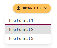
Remaining MUI ButtonBase Components
MUI uses the ButtonBase for many of its clickable components like options in a dropdown menu, action areas, icon buttons, etc.
Adding an accessible focus indicator to the ButtonBase class will ensure that the vast majority of clickable components in our SPA can be easily navigated using the keyboard.
Open the Provider/Provider.tsx file and update the theme constant declaration as shown below:
const theme = React.useMemo(
    () =>
        createTheme({
            ...themeOptions,
            palette: {
                mode:
                    themeMode == null
                        ? prefersDarkMode
                            ? 'dark'
                            : 'light'
                        : themeMode,
                primary: {
                    main: primary_color
                },
                secondary: {
                    main: secondary_color
                },
            },
            components: {
                ...themeOptions.components,
                MuiButtonBase: {
                    styleOverrides: {
                        root: {
                            "&:focus-visible": {
                                outline: `2px solid ${primary_color}`,
                            },
                        },
                    },
                }
            }
        }),
    [themeMode, prefersDarkMode]
)
We added a focus indicator that uses the primary color of our theme to the MuiButtonBase component.
Save the file and then try to tab through the options in the “Download” button dropdown menu on “Page 1”:
If your website uses additional MUI components that were not covered, it is important to ensure that all of them have accessible focus indicators that mimic the ones shown in this learning module.