Dark and Light Mode
A responsive website should follow the theme preference set by the user on their operating system (OS) or web browser. Material UI allows us to switch between light and dark themes based on user preference by using the ThemeProvider component and a toggle switch. In this section, we will add a light/dark mode toggle to our navigation bar and we will learn how to leverage the useMediaQuery hook and the prefers-color-scheme media query to enable dark mode automatically by checking the user’s preference in their OS or browser settings.
Modify theme.ts
We had previously set the primary and secondary colors of our theme in the config/theme.ts file. However, when using dark mode in our website, we will need to desaturate these colors to maintain a satisfactory level of contrast between the elements on screen and improve readability. Therefore, we will need to remove the primary and secondary color definitions from theme.ts since these values will now be set programmatically depending on the theme mode used.
Delete the following lines from theme.ts:
palette: {
    primary: {
        main: "#7a003c"
    },
    secondary: {
        main: "#fdbf57"
    }
},
Determine Desaturated Theme Colors
We will use the MUI Color Palette Tool to determine the desaturated variant of our theme colors.
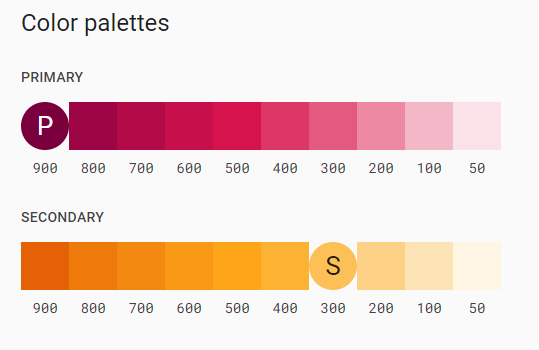
Colors in the [200,50] range can be used in dark mode. For our theme, the desaturated primary color is #ed89a3, and the desaturated secondary color is #fdd287.
Modify template.tsx
Open app/template.tsx and add the following import statements:
import useMediaQuery from '@mui/material/useMediaQuery'
Create and export the ColorModeContext constant, which will allow us to read and modify the theme mode of our website from the navigation bar. The following code should be added before the Template function declaration:
export const ColorModeContext = React.createContext({
    toggleColorMode: () => {},
})
Next, we will read the value of the media prefers-color-scheme query and save it as a Boolean constant whose value is true if the user currently has dark mode enabled on their system. We will also use the React state hook to create a mode constant with a null initial value and a setColor function that is used to update the mode constant.
Add the following lines of the code at the top of the Template function:
const prefersDarkMode = useMediaQuery('(prefers-color-scheme: dark)')

const [mode, setMode] = React.useState<'light' | 'dark' | null>(null)
Define the primary and secondary colors and replace the const theme declaration with the following updated declaration:
const primary_color = themeMode == null
        ? prefersDarkMode
            ? '#ed89a3'
            : '#7a003c'
        : themeMode == 'light'
            ? '#7a003c'
            : '#ed89a3';

const secondary_color = themeMode == null
	? prefersDarkMode
		? '#fdd287'
		: '#fdbf57'
	: themeMode == 'light'
		? '#fdbf57'
		: '#fdd287';

const theme = React.useMemo(
        () =>
            createTheme({
                ...themeOptions,
                palette: {
                    mode:
                        themeMode == null
                            ? prefersDarkMode
                                ? 'dark'
                                : 'light'
                            : themeMode,
                    primary: {
                        main: primary_color
                    },
                    secondary: {
                        main: secondary_color
                    },
                },
            }),
        [themeMode, prefersDarkMode]
    )
This updated declaration utilizes the React useMemo hook to create and cache a theme value. The value of the mode attribute is determined by examining the the value of the themeMode constant we created earlier. The diagram below explains the conditional logic used to determine the value of mode:  When using dark mode, the primary and secondary colors of our theme are desaturated to retain readability and enhance contrast. The values of these colors are now determined programmatically as shown in the diagrams below:

We will now make use of the React useMemo hook to calculate and cache the value of the colorMode constant. Add the following lines of code after the theme declaration:
 const colorMode = React.useMemo(
        () => ({
            toggleColorMode: () => {
                setThemeMode(prevMode => (prevMode == null ? (theme.palette.mode === 'dark' ? 'light' : 'dark') : prevMode === 'light' ? 'dark' : 'light'))
            },
        }),
        [theme]
    )
Finally, wrap the returned elements of the App function with the ColorModeContext.Provider:
return <>
        <ColorModeContext.Provider value={colorMode}>
            <ThemeProvider theme={theme}>
              <Navbar />
              <CssBaseline />
              {children}
              <Footer />
          </ThemeProvider>
        </ColorModeContext.Provider>
    </>
Your template.tsx file should now look like this:
'use client';

import React from 'react'
import CssBaseline from '@mui/material/CssBaseline'
import {createTheme, ThemeProvider} from '@mui/material/styles'
import themeOptions from '@/config/theme'
import Navbar from "@/components/Navbar/Navbar";
import useMediaQuery from '@mui/material/useMediaQuery'
import Footer from "@/components/Footer/Footer";

export const ColorModeContext = React.createContext({
    toggleColorMode: () => {},
})

export default function Template({children}: {children?: React.ReactNode} ) {
    const prefersDarkMode = useMediaQuery('(prefers-color-scheme: dark)')
    const [themeMode, setThemeMode] = React.useState<'light' | 'dark' | null>(null)

	const primary_color = themeMode == null
	        ? prefersDarkMode
	            ? '#ed89a3'
	            : '#7a003c'
	        : themeMode == 'light'
	            ? '#7a003c'
	            : '#ed89a3';

	const secondary_color = themeMode == null
		? prefersDarkMode
			? '#fdd287'
			: '#fdbf57'
		: themeMode == 'light'
			? '#fdbf57'
			: '#fdd287';

	const theme = React.useMemo(
	        () =>
	            createTheme({
	                ...themeOptions,
	                palette: {
	                    mode:
	                        themeMode == null
	                            ? prefersDarkMode
	                                ? 'dark'
	                                : 'light'
	                            : themeMode,
	                    primary: {
	                        main: primary_color
	                    },
	                    secondary: {
	                        main: secondary_color
	                    },
	                },
	            }),
	        [themeMode, prefersDarkMode]
	    )

    const colorMode = React.useMemo(
        () => ({
            toggleColorMode: () => {
                setThemeMode(prevMode => (prevMode == null ? (theme.palette.mode === 'dark' ? 'light' : 'dark') : prevMode === 'light' ? 'dark' : 'light'))
            },
        }),
        [theme]
    )

    return <>
        <ColorModeContext.Provider value={colorMode}>
            <ThemeProvider theme={theme}>
                <Navbar />
                <CssBaseline />
                {children}
                <Footer />
            </ThemeProvider>
        </ColorModeContext.Provider>
    </>
}
Add Light/Dark Mode Toggle to Navigation Bar
We will now add a responsive toggle to our navigation bar that allows the user to easily switch between dark and light mode. Start by adding the following import statements to Navbar.tsx:
import {useTheme} from '@mui/material/styles'
import Brightness4Icon from '@mui/icons-material/Brightness4'
import Brightness7Icon from '@mui/icons-material/Brightness7'
import {ColorModeContext} from '@/app/template'
Next, we will use the useTheme hook to access the theme variables in Navbar.tsx in addition to the useContext hook to grab the current context value of the ColorModeContext imported from app/template.tsx.
Add the following two lines to the top of the Navbar function:
const theme = useTheme()
const colorMode = React.useContext(ColorModeContext)
We will now add the toggle button to the navigation bar. Add the following lines of code before the Box containing the settings icon:
<Box sx=}>
    <Tooltip
        title={
            theme.palette.mode === 'dark'
                ? 'Switch to Light Mode'
                : 'Switch to Dark Mode'
        }
    >
        <MacIconNavButton
            sx=
            onClick={colorMode.toggleColorMode}
            color="inherit"
        >
            {theme.palette.mode === 'dark' ? (
                <Brightness7Icon />
            ) : (
                <Brightness4Icon />
            )}
        </MacIconNavButton>
    </Tooltip>
</Box>
We are a use the custom MacIconNavButton component that we created earlier and the MUI Tooltip component. Notice that the icon and the tooltip message displayed change according to the value of the current theme.
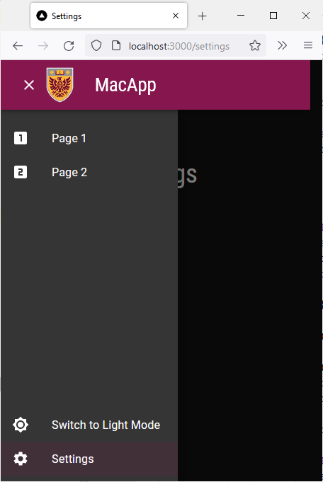
We will now update the pages_drawer function to display the dark/light mode toggle in the app drawer. Add the following lines of code to the pages_drawer function at the top of the second List component:
<ListItem key={'mode'} disablePadding>
	<ListItemButton onClick={colorMode.toggleColorMode}
					color="inherit" >
		<ListItemIcon>
			{theme.palette.mode === 'dark' ? (
				<Brightness7Icon />
			) : (
				<Brightness4Icon />
			)}
		</ListItemIcon>
		<ListItemText primary={theme.palette.mode === 'dark'
			? 'Switch to Light Mode'
			: 'Switch to Dark Mode'} />
	</ListItemButton>
</ListItem>
Your Navbar.tsx file should now look like this:
import AppBar from '@mui/material/AppBar'
import Box from '@mui/material/Box'
import Toolbar from '@mui/material/Toolbar'
import Typography from '@mui/material/Typography'
import MenuIcon from '@mui/icons-material/Menu'
import Container from '@mui/material/Container'
import Link from 'next/link'
import {usePathname, useRouter} from 'next/navigation'
import styles from '@/styles/NavBar.module.css'
import {MacIconNavButton, MacNavButton,} from '@/components/MacComponents/MacNavButton'
import Tooltip from '@mui/material/Tooltip'
import Drawer from "@mui/material/Drawer";
import List from "@mui/material/List";
import ClearIcon from '@mui/icons-material/Clear';
import ListItem from "@mui/material/ListItem";
import ListItemButton from "@mui/material/ListItemButton";
import ListItemIcon from "@mui/material/ListItemIcon";
import ListItemText from "@mui/material/ListItemText";
import LooksOneIcon from '@mui/icons-material/LooksOne';
import LooksTwoIcon from '@mui/icons-material/LooksTwo';
import SettingsIcon from '@mui/icons-material/Settings'
import {useTheme} from '@mui/material/styles'
import Brightness4Icon from '@mui/icons-material/Brightness4'
import Brightness7Icon from '@mui/icons-material/Brightness7'
import {ColorModeContext} from "@/app/template";
import React from "react";
const pages = [
['Page 1', '/page_1'],
['Page 2', '/page_2'],
]
export default function Navbar() {
const theme = useTheme()
const colorMode = React.useContext(ColorModeContext)
const imgStyle = {
paddingTop: '10px',
paddingBottom: '10px',
paddingRight: '30px',
}
const [state, setState] = React.useState(false);
const toggleDrawer =
(open: boolean) =>
(event: React.KeyboardEvent | React.MouseEvent) => {
if (
event.type === 'keydown' &&
((event as React.KeyboardEvent).key === 'Tab' ||
(event as React.KeyboardEvent).key === 'Shift')
) {
return;
}
setState(open);
};
const router = useRouter()
const currentRoute = usePathname()
const icons = [<LooksOneIcon key={'transcripts-page'} />, <LooksTwoIcon key={'privacy-policy'}/>]
const pages_drawer = () => (
<Box
paddingTop={1}
sx={{ width: 250 }}
role="presentation"
onKeyDown={toggleDrawer(false)}
>
<List>
{pages.map((page, index) => (
<ListItem key={page[0]} disablePadding>
<ListItemButton onClick={toggleDrawer(false)} component={Link} href={page[1]} selected= {currentRoute === page[1]} >
<ListItemIcon>
{icons[index]}
</ListItemIcon>
<ListItemText primary={page[0]} />
</ListItemButton>
</ListItem>
))}
</List>
<List style={{ position: "absolute", bottom: "0", right: "0", left: "0"}}>
<ListItem key={'mode'} disablePadding>
<ListItemButton onClick={colorMode.toggleColorMode}
color="inherit" >
<ListItemIcon>
{theme.palette.mode === 'dark' ? (
<Brightness7Icon />
) : (
<Brightness4Icon />
)}
</ListItemIcon>
<ListItemText primary={theme.palette.mode === 'dark'
? 'Switch to Light Mode'
: 'Switch to Dark Mode'} />
</ListItemButton>
</ListItem>
<ListItem key={'settings'} disablePadding>
<ListItemButton onClick={toggleDrawer(false)} component={Link} href={'/settings'} selected= {currentRoute === '/settings'} color="inherit" >
<ListItemIcon>
<SettingsIcon />
</ListItemIcon>
<ListItemText primary={'Settings'} />
</ListItemButton>
</ListItem>
</List>
</Box>
);
return (
<AppBar
position="relative"
enableColorOnDark
style={{backgroundImage: 'none'}}
sx={{zIndex: theme => theme.zIndex.drawer + 1, borderRadius: 0}}
>
<Container maxWidth="xl">
<Toolbar disableGutters>
<Box sx={{flexGrow: 1, display: {xs: 'flex', md: 'none'}}}>
<Tooltip enterDelay={500} title={state ? "Close App Drawer" : "Open App Drawer"}>
<MacIconNavButton
size="large"
aria-controls="menu-appbar"
aria-haspopup="true"
onClick={toggleDrawer(!state)}
color="inherit"
>
{state ? <ClearIcon /> : <MenuIcon />}
</MacIconNavButton>
</Tooltip>
<Drawer
anchor={"left"}
open={state}
onClose={toggleDrawer(false)}
sx={{
'& .MuiDrawer-root': {
position: 'absolute'
},
'& .MuiPaper-root': {
position: 'absolute',
borderRadius: 0
},
minWidth: 100,
width: "20%",
position: "absolute",
top: '70px',
display: {xs: 'flex', md: 'none'}
}}
>
{pages_drawer()}
</Drawer>
<Box
justifyContent="center"
alignItems="center"
sx={{alignItems: 'center', display: {xs: 'flex', md: 'none'}}}
>
<Box
component="img"
sx={{
height: 70,
width: '100%',
}}
alt="McMaster Logo"
src="/assets/logo-small.png"
style={imgStyle}
/>
<Typography
variant="h3"
component={Link}
href="/"
sx={{
mr: 2,
flexGrow: 1,
color: 'inherit',
textDecoration: 'none',
"&:hover": {
color: useTheme().palette.secondary.main
}
}}
>
MacApp
</Typography>
</Box>
</Box>
<Box
component="img"
sx={{
height: 78.31,
width: 140,
display: {xs: 'none', md: 'flex'}
}}
alt="McMaster Logo"
src="/assets/logo.png"
style={imgStyle}
/>
<Typography
variant="h3"
noWrap
component={Link}
href="/"
sx={{
mr: 2,
display: {xs: 'none', md: 'flex'},
textDecoration: 'none',
color: 'inherit',
"&:hover": {
color: useTheme().palette.secondary.main
}
}}
>
MacApp
</Typography>
<Box sx={{flexGrow: 1, display: {xs: 'none', md: 'flex'}}}>
{pages.map(page => (
<MacNavButton
key={page[0]}
component={Link}
href={page[1]}
className={
currentRoute === page[1]
? styles.active
: styles.nonActive
}
sx={{my: 2, color: 'white', display: 'block'}}
>
{page[0]}
</MacNavButton>
))}
</Box>
<Box sx={{paddingRight: 1, display: {xs: 'none', md: 'flex'}}}>
<Tooltip
title={
theme.palette.mode === 'dark'
? 'Switch to Light Mode'
: 'Switch to Dark Mode'
}
>
<MacIconNavButton
sx={{ml: 1}}
onClick={colorMode.toggleColorMode}
color="inherit"
>
{theme.palette.mode === 'dark' ? (
<Brightness7Icon />
) : (
<Brightness4Icon />
)}
</MacIconNavButton>
</Tooltip>
</Box>
<Box sx={{paddingRight: 1, display: {xs: 'none', md: 'flex'}}}>
<Tooltip title="Settings">
<MacIconNavButton
aria-label="settings"
color="inherit"
component={Link}
className={
currentRoute === '/settings'
? styles.active
: styles.nonActive
}
href="/settings"
>
<SettingsIcon />
</MacIconNavButton>
</Tooltip>
</Box>
</Toolbar>
</Container>
</AppBar>
);
}
Go back to your browser and try switching mode by using the sundial icon in the navigation bar. 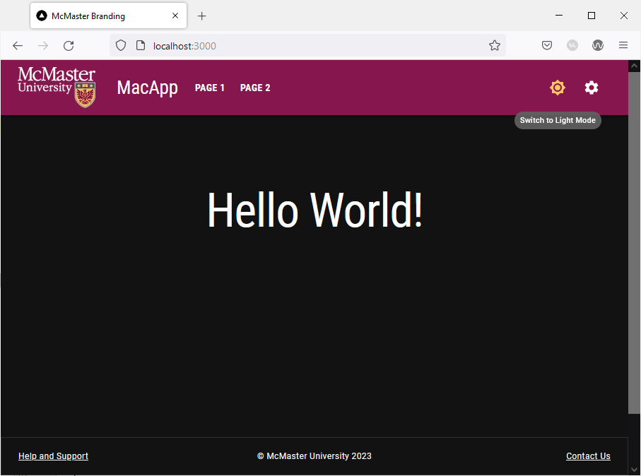
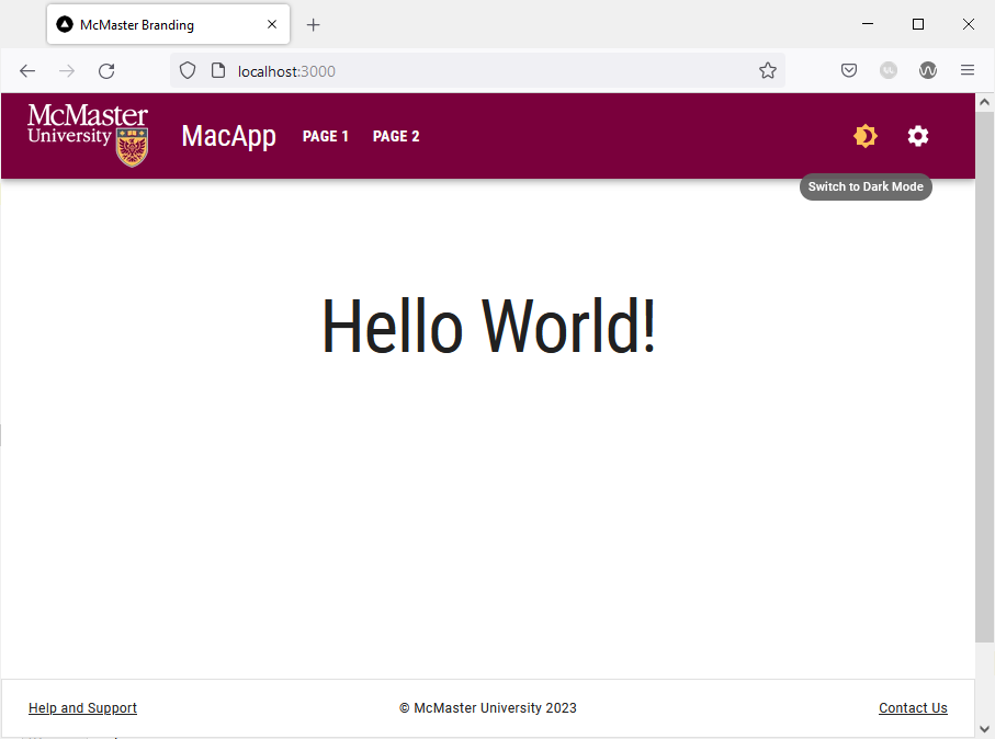
The chosen mode is automatically applied to all pages of the website. Try navigating to “Page1”, “Page 2” and the “Settings” page. They will all automatically use the chosen mode and the text and UI element colors will change to maintain readability.
Try enabling dark mode on your system and then navigate to the website in a new tab or reload the current tab. The website should automatically use dark mode when you first load the page. Note that you can still manually switch to light mode using the sundial icon.
On small screen devices, the dark/light mode toggle can be found in the app drawer: