Interactive UI Elements
Modern websites requires the use of UI elements that not only allow the user to perform a wide range of functions, but also react to the user’s actions in an intuitive manner. MUI offers a number of customizable built-in components that adhere to the Material Design Language. In this section, we will learn how to style certain MUI components to conform to the stylistic guidelines set by McMaster Digital Brand Standards Manual. The aim of this section is not to provide a comprehensive tutorial on how to use these different MUI components (this information is covered in the Material UI Documentation), but to modify the components’ behavior and appearance to fit the McMaster Digital Brand Standards.
Buttons
We have already create a styled MuiButton component called MacButton in the “Breadcrumbs With a Universal Back Button” section. We will now show a couple more examples of how we can use the styled MacButton component in different ways.
Open the app/page.tsx file and add the following import statements:
import React from "react";
import Stack from "@mui/material/Stack";
import Snackbar from '@mui/material/Snackbar';
import IconButton from '@mui/material/IconButton';
import CloseIcon from '@mui/icons-material/Close';
Declare and export these two interfaces above the Home function:
export interface SnackbarMessage {
    message: string;
    key: number;
}

export interface State {
    open: boolean;
    snackPack: readonly SnackbarMessage[];
    messageInfo?: SnackbarMessage;
}
Add the following lines of code at the top of the Page function:
const [snackPack, setSnackPack] = React.useState<readonly SnackbarMessage[]>([]);
const [open, setOpen] = React.useState(false);
const [messageInfo, setMessageInfo] = React.useState<SnackbarMessage | undefined>(
    undefined,
);

React.useEffect(() => {
    if (snackPack.length && !messageInfo) {
        // Set a new snack when we don't have an active one
        setMessageInfo({ ...snackPack[0] });
        setSnackPack((prev) => prev.slice(1));
        setOpen(true);
    } else if (snackPack.length && messageInfo && open) {
        // Close an active snack when a new one is added
        setOpen(false);
    }
}, [snackPack, messageInfo, open]);

const handleClick = (message: string) => () => {
    setSnackPack((prev) => [...prev, { message, key: new Date().getTime() }]);
};

const handleClose = (event: React.SyntheticEvent | Event, reason?: string) => {
    if (reason === 'clickaway') {
        return;
    }
    setOpen(false);
};

const handleExited = () => {
    setMessageInfo(undefined);
};

const action = (
    <React.Fragment>
        <IconButton
            size="small"
            aria-label="close"
            color="inherit"
            onClick={handleClose}
        >
            <CloseIcon fontSize="small" />
        </IconButton>
    </React.Fragment>
);
This code snippet is used to handle opening and closing the popup message that will be shown when clicking the MacButton components that we will add shortly.
Delete the line containing the Typography component and replace it with the following lines of code:
<Snackbar
    sx={ {paddingTop: 10} }
    open={open}
    autoHideDuration={6000}
    onClose={handleClose}
    TransitionProps={ { onExited: handleExited } }
    message={messageInfo ? messageInfo.message : undefined}
    action={action}
    anchorOrigin={ {vertical: 'top', horizontal: 'right'} }
/>
<Stack
    direction="column"
    justifyContent="space-between"
    alignItems="center"
    spacing={5}
>
    <Typography variant="h1">Hello World!</Typography>
    <Stack
        direction="row"
        justifyContent="space-between"
        alignItems="center"
        spacing={2}
    >
        <MacButton variant="contained" mainColor="primary" onClick={handleClick('Primary Button Clicked!')}>Primary</MacButton>
        <MacButton variant="contained" mainColor="secondary" onClick={handleClick('Secondary Button Clicked!')}>Secondary</MacButton>
    </Stack>
</Stack>
We used the MUI Stack component to stack the “Hello World!” message vertically on top of another Stack containing two buttons in a row. The Snackbar component is used to display the popup message shown after clicking a button. The MUI guidelines recommend displaying only one Snackbar message at a time. Hence, if your application has multiple Snackbar messages, you should dismiss the current message before displaying the next one. You can find out more about the MUI Snackbar component by visiting the Snackbar official documentation.
Notice that the mainColor on the first button is "primary", whereas the second button uses the "secondary" color.
Go back to your browser, your homepage should now look like this: 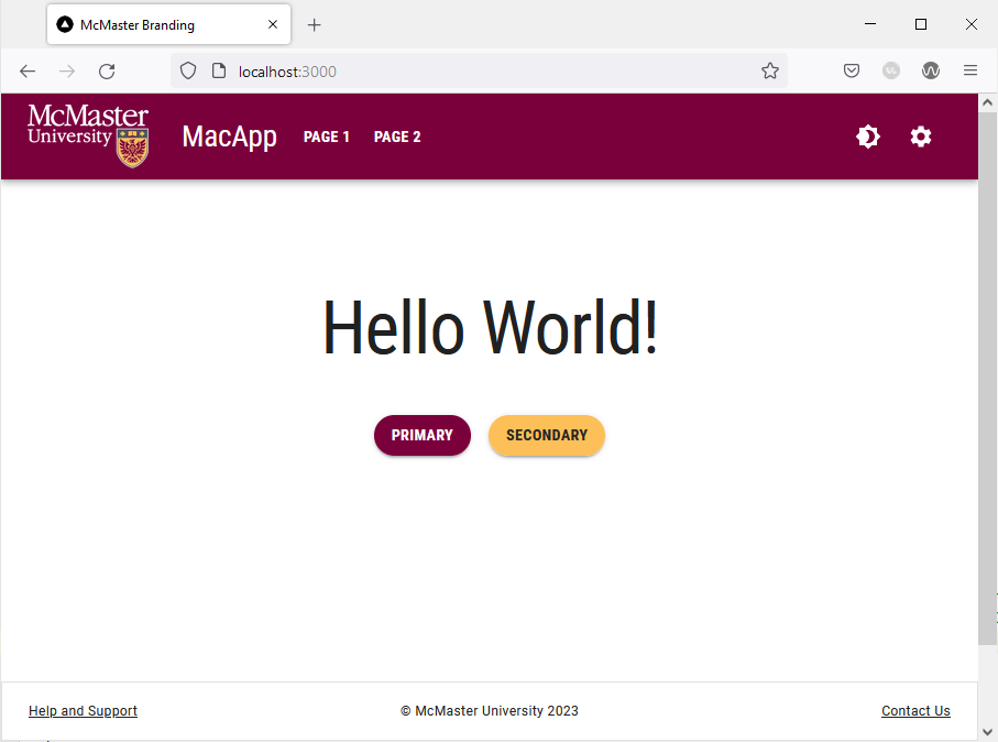 Notice that the buttons are always rounded and not rectangular in shape as recommended by the McMaster Digital Brand Standards Manual. The buttons are rounded by default since we have already set the
 borderRadius attribute in our theme to 28.
Hovering over the Heritage Maroon button will turn cause it to turn dark grey: 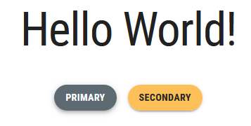
Similarly, hovering over the “Secondary” button will turn cause it to turn light grey: 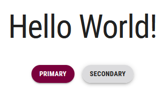
File Input Widget
Material UI does not offer a native file input widget. However, there exists a third-party widget called MUI file input that follows the Material Design guidelines and allows the end user to upload files to a website. We will now explain how to use this widget and how to style it to conform to the McMaster Digital Standards.
Start by installing the MUI file input widget by navigating to the root directory of your project and running the following command:
npm install mui-file-input --save
Next, open the app/page.tsx file and add the following import statement:
import {MuiFileInput} from 'mui-file-input'
Declare the selectedFiles constant and setSelectedFiles function at the top of the Home function the using the React state hook:
const [selectedFiles, setSelectedFiles] = React.useState<File[]>([]);
We will also need to create a handleChange function inside the Home function to handle the file upload:
const handleChange = (newFiles: File[]) => {
	setSelectedFiles(newFiles);
}
Finally add the following lines of code right after the closing tag of the Stack containing the two buttons:
<MuiFileInput
	multiple
	placeholder="Click here and select file(s)"
	value={selectedFiles}
	onChange={handleChange}
	hideSizeText
/>
The multiple prop indicates that the file input widget can accept multiple files at the same time. The hideSizeText prop prevents the widget from showing the size of the uploaded file(s).
Your app/page.tsx file should now contain the following lines of code:
'use client';

import React from "react";
import Head from 'next/head'
import styles from '@/styles/page.module.css'
import Typography from '@mui/material/Typography'
import {MacButton} from "@/components/MacComponents/MacButton";
import Stack from "@mui/material/Stack";
import Snackbar from '@mui/material/Snackbar';
import IconButton from '@mui/material/IconButton';
import CloseIcon from '@mui/icons-material/Close';
import {MuiFileInput} from 'mui-file-input'

export interface SnackbarMessage {
    message: string;
    key: number;
}

export interface State {
    open: boolean;
    snackPack: readonly SnackbarMessage[];
    messageInfo?: SnackbarMessage;
}

export default function Page() {
    const [selectedFiles, setSelectedFiles] = React.useState<File[]>([]);
    const [snackPack, setSnackPack] = React.useState<readonly SnackbarMessage[]>([]);
    const [open, setOpen] = React.useState(false);
    const [messageInfo, setMessageInfo] = React.useState<SnackbarMessage | undefined>(
        undefined,
    );

    React.useEffect(() => {
        if (snackPack.length && !messageInfo) {
            // Set a new snack when we don't have an active one
            setMessageInfo({ ...snackPack[0] });
            setSnackPack((prev) => prev.slice(1));
            setOpen(true);
        } else if (snackPack.length && messageInfo && open) {
            // Close an active snack when a new one is added
            setOpen(false);
        }
    }, [snackPack, messageInfo, open]);

    const handleClick = (message: string) => () => {
        setSnackPack((prev) => [...prev, { message, key: new Date().getTime() }]);
    };

    const handleClose = (event: React.SyntheticEvent | Event, reason?: string) => {
        if (reason === 'clickaway') {
            return;
        }
        setOpen(false);
    };

    const handleExited = () => {
        setMessageInfo(undefined);
    };

    const action = (
        <React.Fragment>
            <IconButton
                size="small"
                aria-label="close"
                color="inherit"
                onClick={handleClose}
            >
                <CloseIcon fontSize="small" />
            </IconButton>
        </React.Fragment>
    );

    const handleChange = (newFiles: File[]) => {
        setSelectedFiles(newFiles);
    }

    return (
    <>
      <Head>
        <title>McMaster Branding</title>
        <meta name="description" content="Generated by create next app" />
        <meta name="viewport" content="width=device-width, initial-scale=1" />
        <link rel="icon" href="/favicon.ico" />
      </Head>
      <main className={styles.main}>
          <Snackbar
              sx=
              open={open}
              autoHideDuration={6000}
              onClose={handleClose}
              TransitionProps=
              message={messageInfo ? messageInfo.message : undefined}
              action={action}
              anchorOrigin=
          />
          <Stack
              direction="column"
              justifyContent="space-between"
              alignItems="center"
              spacing={5}
          >
              <Typography variant="h1">Hello World!</Typography>
              <Stack
                  direction="row"
                  justifyContent="space-between"
                  alignItems="center"
                  spacing={2}
              >
                  <MacButton variant="contained" mainColor="primary" onClick={handleClick('Primary Button Clicked!')}>Primary</MacButton>
                  <MacButton variant="contained" mainColor="secondary" onClick={handleClick('Secondary Button Clicked!')}>Secondary</MacButton>
              </Stack>
              <MuiFileInput
                  multiple
                  placeholder="Click here and select file(s)"
                  value={selectedFiles}
                  onChange={handleChange}
                  hideSizeText
              />
          </Stack>
      </main>
    </>
  )
}
Go back to your browser, your website should now contain a file input widget after the two buttons. Akin to the buttons, the file input uses rounded corners by default owing to the theme borderRadius value of 28.  Clicking on the widget allows you to select one or more files to upload.
Dropdown Menu
Dropdown menus allow the user to select an option from a given list. Material UI provides a Select component that can be used to generate dropdown menus. In this section, we will learn how to implement a dropdown menu in MUI and how to style it to fit the McMaster Digital Brand Standards. We will add the dropdown menu to the “Notifications” tab of the settings page.
Open the components/TabPanel/VerticalTabs.tsx file and add the following import statement:
import {FormControl, InputLabel, MenuItem, Select} from '@mui/material'
Next, replace the Placeholder 1 line after <TabPanel value={value} index={0}> with the following lines of code:
<FormControl sx={{m: 1, minWidth: 300}}>
	<InputLabel id="demo-simple-select-label">
	Demo Dropdown Menu
	</InputLabel>
	<Select
	labelId="demo-simple-select-label"
	id="demo-simple-select"
	label="Demo Dropdown Menu"
>
	<MenuItem value={1}>Option 1</MenuItem>
	<MenuItem value={2}>Option 2</MenuItem>
	<MenuItem value={3}>Option 3</MenuItem>
	</Select>
</FormControl>
We wrapped our dropdown in a FormControl component, which is a utility that wraps an input component with other associated components in order to make the state of the input available to those components. We also used the InputLabel component to display the name of the dropdown menu (i.e., the Select component). We also make use of the MenuItem component to add options to the dropdown menu. Notice that the value associated with each option is set using the value prop.
Your components/TabPanel/VerticalTabs.tsx file should now contain the following lines:
import * as React from 'react'
import Tabs from '@mui/material/Tabs'
import Tab from '@mui/material/Tab'
import Typography from '@mui/material/Typography'
import Box from '@mui/material/Box'
import {FormControl, InputLabel, MenuItem, Select} from '@mui/material'
import Drawer from '@mui/material/Drawer';
import List from '@mui/material/List';
import ListItem from '@mui/material/ListItem';
import ListItemButton from '@mui/material/ListItemButton';
import ListItemIcon from '@mui/material/ListItemIcon';
import ListItemText from '@mui/material/ListItemText';
import NotificationsNoneOutlinedIcon from '@mui/icons-material/NotificationsNoneOutlined';
import LockOutlinedIcon from '@mui/icons-material/LockOutlined';
import SettingsAccessibilityOutlinedIcon from '@mui/icons-material/SettingsAccessibilityOutlined';
import ManageAccountsOutlinedIcon from '@mui/icons-material/ManageAccountsOutlined';
import FormatListBulletedOutlinedIcon from '@mui/icons-material/FormatListBulletedOutlined';
import IconButton from "@mui/material/IconButton";

interface TabPanelProps {
    children?: React.ReactNode
    index: number
    value: number
}

function TabPanel(props: TabPanelProps) {
    const {children, value, index, ...other} = props

    return (
        <div
            role="tabpanel"
            hidden={value !== index}
            id={`vertical-tabpanel-${index}`}
            aria-labelledby={`vertical-tab-${index}`}
            {...other}
        >
            {value === index && (
                <Box sx={{p: 3}}>
                    <Typography>{children}</Typography>
                </Box>
            )}
        </div>
    )
}

function a11yProps(index: number) {
    return {
        id: `vertical-tab-${index}`,
        'aria-controls': `vertical-tabpanel-${index}`,
    }
}


export default function VerticalTabs() {
    const [value, setValue] = React.useState(0)

    const handleChange = (event: React.SyntheticEvent, newValue: number) => {
        setValue(newValue)
    }

    const tabs = ['Notifications', 'Privacy', 'Accessibility', 'Account'];
    const icons = [<NotificationsNoneOutlinedIcon key={'notifications'}/>, <LockOutlinedIcon key={'privacy'}/>, <SettingsAccessibilityOutlinedIcon key={'accessibility'}/>, <ManageAccountsOutlinedIcon key={'account'}/>]

    const handleChangeDrawer = (e: React.MouseEvent<HTMLDivElement>, newValue: number) => {
        setValue(newValue);
    }

    const [state, setState] = React.useState(false);

    const toggleDrawer =
        (open: boolean) =>
            (event: React.KeyboardEvent | React.MouseEvent) => {
                if (
                    event.type === 'keydown' &&
                    ((event as React.KeyboardEvent).key === 'Tab' ||
                        (event as React.KeyboardEvent).key === 'Shift')
                ) {
                    return;
                }
                setState(open);
            };

    const list = () => (
        <Box
            sx={{ width:  250 }}
            role="presentation"
            onClick={toggleDrawer(false)}
            onKeyDown={toggleDrawer(false)}
        >
            <List>
                {tabs.map((text, index) => (
                    <ListItem key={text} disablePadding>
                        <ListItemButton selected= {value === index} onClick={(e) => handleChangeDrawer(e, index)}>
                            <ListItemIcon>
                                {icons[index]}
                            </ListItemIcon>
                            <ListItemText primary={text} />
                        </ListItemButton>
                    </ListItem>
                ))}
            </List>
        </Box>
    );

    return (
        <>
            <Box sx={{flexGrow: 1, bgcolor: 'background.paper', display: 'flex'}}>
                <Tabs
                    orientation="vertical"
                    variant="scrollable"
                    value={value}
                    onChange={handleChange}
                    aria-label="Vertical tabs"
                    sx={{borderRight: 1, borderColor: 'divider', display: {xs: 'none', md: 'flex'}}}
                >
                    {tabs.map((text, index) => (
                        <Tab key={text} label={text} icon={icons[index]} iconPosition="start" {...a11yProps(index)} />
                    ))}
                </Tabs>
                <Box sx={{paddingTop: '19px'}}>
                    <IconButton title="Settings Drawer" aria-label="settings-menu" onClick={toggleDrawer(true)} sx={{ display: {xs: 'inline', md: 'none'}, height:'40px'}}> <FormatListBulletedOutlinedIcon /> </IconButton>
                </Box>
                <Drawer
                    anchor={"left"}
                    open={state}
                    onClose={toggleDrawer(false)}
                    sx={{
                        '& .MuiDrawer-root': {
                            position: 'absolute'
                        },
                        '& .MuiPaper-root': {
                            position: 'absolute'
                        },
                        minWidth: 100,
                        width: "20%",
                        position: "absolute",
                        top: '230px',
                        left: '2%',
                        height: '50%',
                        display: {xs: 'flex', md: 'none'}
                    }}                        >
                    {list()}
                </Drawer>
                <TabPanel value={value} index={0}>
                    <Typography
                        sx={{display: {xs: 'flex', md: 'none'}, justifyContent: 'left', paddingLeft: '10px'}}
                        variant="settingTitle"
                        gutterBottom
                    >
                        Notifications
                    </Typography>
                    <FormControl sx={{m: 1, minWidth: 300}}>
                        <InputLabel id="demo-simple-select-label">
                            Demo Dropdown Menu
                        </InputLabel>
                        <Select
                            labelId="demo-simple-select-label"
                            id="demo-simple-select"
                            label="Demo Dropdown Menu"
                        >
                            <MenuItem value={1}>Option 1</MenuItem>
                            <MenuItem value={2}>Option 2</MenuItem>
                            <MenuItem value={3}>Option 3</MenuItem>
                        </Select>
                    </FormControl>
                </TabPanel>
                <TabPanel value={value} index={1}>
                    <Typography
                        sx={{display: {xs: 'flex', md: 'none'}, justifyContent: 'left', paddingLeft: '10px'}}
                        variant="settingTitle"
                        gutterBottom
                    >
                        Privacy
                    </Typography>
                    Placeholder 2
                </TabPanel>
                <TabPanel value={value} index={2}>
                    <Typography
                        sx={{display: {xs: 'flex', md: 'none'}, justifyContent: 'left', paddingLeft: '10px'}}
                        variant="settingTitle"
                        gutterBottom
                    >
                        Accessibility
                    </Typography>
                    Placeholder 3
                </TabPanel>
                <TabPanel value={value} index={3}>
                    <Typography
                        sx={{display: {xs: 'flex', md: 'none'}, justifyContent: 'left', paddingLeft: '10px'}}
                        variant="settingTitle"
                        gutterBottom
                    >
                        Account
                    </Typography>
                    Placeholder 4
                </TabPanel>
            </Box>
        </>
    )
}
Navigate to the settings page by clicking on the gear icon in the navigation bar, and you will see that the “Notifications” tab now contains a dropdown menu.
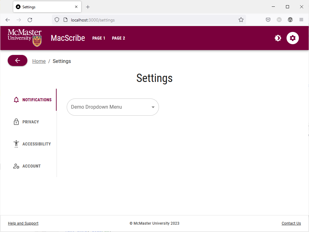
The borders on the dropdown menu are rounded as recommended by the McMaster branding guidelines. The rounded borders are due to the global borderRadius attribute being set to 28 in our theme. Clicking on the dropdown menu allows you to select an option. The borders of the dropdown list are significantly less rounded to maintain readability and avoid clipping the options text. We reduced the border radius of the dropdown list by setting the borderRadius attribute of the MuiPaper component to 8 in theme.ts.
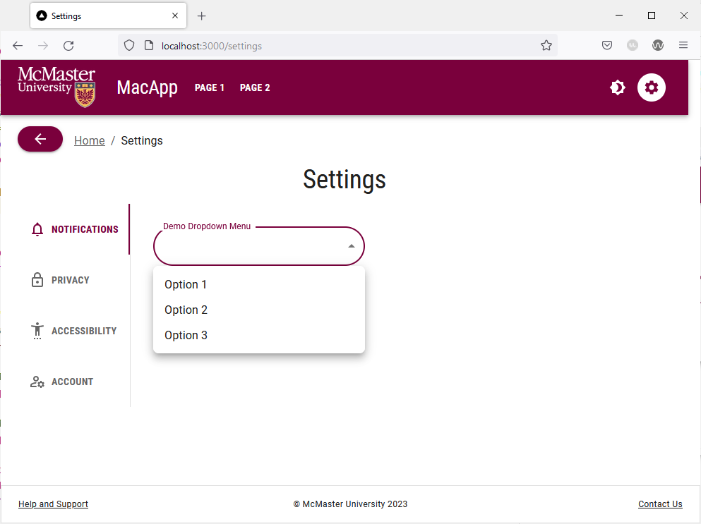
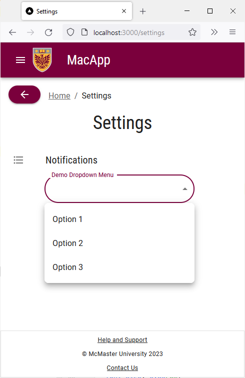
Try shrinking the browser window to see how the dropdown menu looks on devices with a small-sized screen.
Buttons With a Dropdown Menu
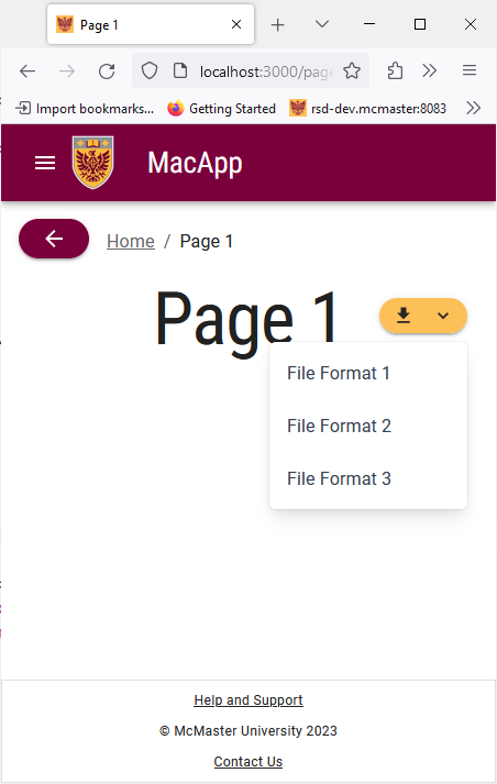
The styled MacButton that we created earlier can be combined with a dropdown menu to create a button that allows the user to execute mutually exclusive functions that fall under the same category e.g., a download button that lets the user choose the file format. We will add this type of button to the “Page 1”.
Open the app/page_1/page.tsx file and add the following import statements:
import React from "react";
import {MacButton} from "@/components/MacComponents/MacButton";
import Menu, {MenuProps} from '@mui/material/Menu';
import MenuItem from '@mui/material/MenuItem';
import KeyboardArrowDownIcon from '@mui/icons-material/KeyboardArrowDown';
import DownloadIcon from '@mui/icons-material/Download';
import {alpha, styled} from '@mui/material/styles';
Next, we will create a styled menu that follows the standards recommended by the official MUI documentation. Add the StyledMenu constant declaration before the Page_1() function declaration:
const StyledMenu = styled((props: MenuProps) => (
    <Menu
        elevation={0}
        disableScrollLock={true}
        anchorOrigin=
        transformOrigin=
        {...props}
    />
))(({theme}) => ({
    '& .MuiPaper-root': {
        borderRadius: 6,
        marginTop: theme.spacing(1),
        minWidth: 180,
        color:
            theme.palette.mode === 'light'
                ? 'rgb(55, 65, 81)'
                : theme.palette.grey[300],
        boxShadow:
            'rgb(255, 255, 255) 0px 0px 0px 0px, rgba(0, 0, 0, 0.05) 0px 0px 0px 1px, rgba(0, 0, 0, 0.1) 0px 10px 15px -3px, rgba(0, 0, 0, 0.05) 0px 4px 6px -2px',
        '& .MuiMenu-list': {
            padding: '4px 0',
        },
        '& .MuiMenuItem-root': {
            '& .MuiSvgIcon-root': {
                fontSize: 18,
                color: theme.palette.text.secondary,
                marginRight: theme.spacing(1.5),
            },
            '&:active': {
                backgroundColor: alpha(
                    theme.palette.primary.main,
                    theme.palette.action.selectedOpacity
                ),
            },
        },
    },
}))
We will now use the React State Hook to create the anchor element used when opening and closing the download menu. Add the following lines of code inside the body of the Page_1() function (before the return statement):
const [anchorEl, setAnchorEl] = React.useState<null | HTMLElement>(null)
const openMenu = Boolean(anchorEl)
const handleClickMenu = (event: React.MouseEvent<HTMLElement>) => {
	setAnchorEl(event.currentTarget)
}
const handleCloseMenu = () => {
	setAnchorEl(null)
}
Modify the Box component containing the “Page 1” Typography component by adding the sx property as shown below:
<Box sx=
	  display="flex"
	  justifyContent="center"
	  alignItems="center">
Finally, add the “Download” MacButton and the StyledMenu containing the different file formats inside the Box component:
<Tooltip title={useMediaQuery(useTheme().breakpoints.down('md')) ? 'Download' : ''} >
  <MacButton
	  id="download-button"
	  sx={{
		  position: 'fixed',
		  top: 20,
		  right: 10,
		  zIndex: 2000,
		  display: 'flex'
	  }}
	  aria-controls={
		  openMenu ? 'download-menu' : undefined
	  }
	  aria-haspopup="true"
	  aria-expanded={openMenu ? 'true' : undefined}
	  variant="contained"
	  onClick={handleClickMenu}
	  startIcon={<DownloadIcon />}
	  endIcon={<KeyboardArrowDownIcon />}
	  mainColor="secondary"
>
	  {useMediaQuery(useTheme().breakpoints.up('md')) ? 'Download' : ''}
  </MacButton>
</Tooltip>

<StyledMenu
    id="download-menu"
    MenuListProps={{
        'aria-labelledby': 'download-button',
    }}
    anchorEl={anchorEl}
    open={openMenu}
    onClose={handleCloseMenu}
>
    <MenuItem onClick={handleClickMenu}>
        Format 1
    </MenuItem>
    <MenuItem onClick={handleClickMenu}>
        Format 2
    </MenuItem>
    <MenuItem onClick={handleClickMenu}>
        Format 3
    </MenuItem>
</StyledMenu>
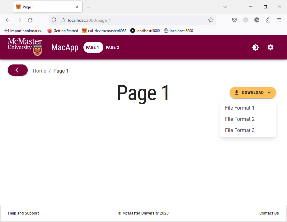
We used the “secondary” variant of the MacButton component. Notice that we used the useMediaQuery function in conjunction with breakpoints to determine if the button should have a tooltip or a “Download” string in it depending on the screen size. On medium and large displays, the button shows a “Download” text sandwiched between a startIcon indicating its function (i.e., the DownloadIcon) and an endIcon consisting of a downwards pointing arrow to inform the user that it is a menu button. On small screens, we removed the “Download” text from the button and replaced it with a tooltip message. The “Download” button is positioned in the top right corner of the page using the sx property on all screen sizes.
Your app/page_1/page.tsx file should now look like this:
'use client';

import React from "react";
import styles from '@/styles/page.module.css'
import Typography from '@mui/material/Typography'
import {useEffect} from "react";
import Container from "@mui/material/Container";
import Box from "@mui/material/Box";
import BreadCrumbs from "@/components/BreadCrumbs/BreadCrumbs";
import {MacButton} from "@/components/MacComponents/MacButton";
import Menu, {MenuProps} from '@mui/material/Menu';
import MenuItem from '@mui/material/MenuItem';
import KeyboardArrowDownIcon from '@mui/icons-material/KeyboardArrowDown';
import DownloadIcon from '@mui/icons-material/Download';
import {alpha, styled} from '@mui/material/styles';
import Tooltip from "@mui/material/Tooltip";

const StyledMenu = styled((props: MenuProps) => (
    <Menu
        elevation={0}
        disableScrollLock={true}
        anchorOrigin={{
            vertical: 'bottom',
            horizontal: 'right',
        }}
        transformOrigin={{
            vertical: 'top',
            horizontal: 'right',
        }}
        {...props}
    />
))(({theme}) => ({
    '& .MuiPaper-root': {
        borderRadius: 6,
        marginTop: theme.spacing(1),
        minWidth: 180,
        color:
            theme.palette.mode === 'light'
                ? 'rgb(55, 65, 81)'
                : theme.palette.grey[300],
        boxShadow:
            'rgb(255, 255, 255) 0px 0px 0px 0px, rgba(0, 0, 0, 0.05) 0px 0px 0px 1px, rgba(0, 0, 0, 0.1) 0px 10px 15px -3px, rgba(0, 0, 0, 0.05) 0px 4px 6px -2px',
        '& .MuiMenu-list': {
            padding: '4px 0',
        },
        '& .MuiMenuItem-root': {
            '& .MuiSvgIcon-root': {
                fontSize: 18,
                color: theme.palette.text.secondary,
                marginRight: theme.spacing(1.5),
            },
            '&:active': {
                backgroundColor: alpha(
                    theme.palette.primary.main,
                    theme.palette.action.selectedOpacity
                ),
            },
        },
    },
}))

export default function Page_1() {
    useEffect(() => {
        document.title = 'Page 1'
    }, [])

    const [anchorEl, setAnchorEl] = React.useState<null | HTMLElement>(null)
    const openMenu = Boolean(anchorEl)
    const handleClickMenu = (event: React.MouseEvent<HTMLElement>) => {
        setAnchorEl(event.currentTarget)
    }
    const handleCloseMenu = () => {
        setAnchorEl(null)
    }

  return (
    <>
      <main className={styles.page}>
          <Container>
              <BreadCrumbs />
              <Box sx={{height: 78, transform: 'translateZ(0px)', flexGrow: 1}}
                  display="flex"
                  justifyContent="center"
                  alignItems="center">
                  <Typography variant="h1">Page 1</Typography>
                  <Tooltip title={useMediaQuery(useTheme().breakpoints.down('md')) ? 'Download' : ''} >
                      <MacButton
                          id="download-button"
                          sx={{
                              position: 'fixed',
                              top: 20,
                              right: 10,
                              zIndex: 2000,
                              display: 'flex'
                          }}
                          aria-controls={
                              openMenu ? 'download-menu' : undefined
                          }
                          aria-haspopup="true"
                          aria-expanded={openMenu ? 'true' : undefined}
                          variant="contained"
                          onClick={handleClickMenu}
                          startIcon={<DownloadIcon />}
                          endIcon={<KeyboardArrowDownIcon />}
                          mainColor="secondary"
                      >
                          {useMediaQuery(useTheme().breakpoints.up('md')) ? 'Download' : ''}
                      </MacButton>
                  </Tooltip>
                  <StyledMenu
                      id="download-menu"
                      MenuListProps={{
                          'aria-labelledby': 'download-button',
                      }}
                      anchorEl={anchorEl}
                      open={openMenu}
                      onClose={handleCloseMenu}
                  >
                      <MenuItem onClick={handleClickMenu}>
                          Format 1
                      </MenuItem>
                      <MenuItem onClick={handleClickMenu}>
                          Format 2
                      </MenuItem>
                      <MenuItem onClick={handleClickMenu}>
                          Format 3
                      </MenuItem>
                  </StyledMenu>
              </Box>
          </Container>
      </main>
    </>
  )
}
Save the file and go back to your browser. Navigate to “Page 1” and you will see the button that we just added.
Try shrinking your browser window horizontally and notice how the button is automatically resized by removing the “Download” text and adding a tooltip message.
Speed Dials
Material UI offers a SpeedDial component that allows developers to create a floating action button containing related actions. The SpeedDial component is often used to group action that manipulate the state of an object e.g., “edit”, “delete”, and “save”. We will now learn how to create a styled SpeedDial component that adheres to McMaster Branding Standards.
Create a MacSpeedDial.tsx file in the components/MacComponents directory and add the following lines of code to it:
import {useTheme} from '@mui/material/styles'
import styled from '@emotion/styled'
import SpeedDial, {SpeedDialProps} from '@mui/material/SpeedDial'

interface MacSpeedDialProps extends SpeedDialProps {
    mainColor: string
}

export const MacSpeedDial = styled(SpeedDial, {shouldForwardProp: (prop) => prop !== "mainColor"})<MacSpeedDialProps>(props => ({
    '& .MuiFab-primary': {
        backgroundColor: props.open
            ? props.mainColor === 'secondary'
                ? '#DBDBDD'
                : '#5E6A71'
            : props.mainColor === 'secondary'
            ? useTheme().palette.secondary.main
            : useTheme().palette.primary.main,
        color: props.mainColor === 'secondary' ? '#262626' : '',
        '&:hover': {
            backgroundColor:
                props.mainColor === 'secondary' ? '#DBDBDD' : '#5E6A71',
        },
    },
}))
We added a mainColor prop to the MacSpeedDial component that will determine the background color, text/icon color and hover color of the button. Akin to the MacButton component, if the mainColor prop is 'primary', then the background color will be Heritage Maroon, the text/icon color will be white and the speed dial will turn a medium shade of grey when the user hovers over it as required by the McMaster Digital Brand Standards guide. Otherwise, if the mainColor prop is 'secondary', then the background color will be Heritage Gold, the text/icon color will be dark grey and the button will turn light grey when the user hovers the mouse over it.
We will now use the MacSpeedDial component on “Page 2”. Open the app/page_2/page.tsx file and add the following import statements:
import React from "react";
import {MacSpeedDial} from '@/components/MacComponents/MacSpeedDial'
import EditIcon from '@mui/icons-material/Edit';
import SaveIcon from '@mui/icons-material/Save';
import DeleteIcon from '@mui/icons-material/Delete'
import {SpeedDialAction, SpeedDialIcon} from "@mui/material";
Next, we will create the openSD constant used to track the state of the speed dial using the React State Hook. We will also create the functions that open and close the speed dial in addition to the action array containing the option that should appear inside the speed dial.
Add the following lines of code inside the Page_2() function (before the return statement):
const [openSD, setOpenSD] = React.useState(false)
const handleOpenSD = () => setOpenSD(true)
const handleCloseSD = () => setOpenSD(false)

const actions = [
	{icon: <EditIcon />, name: 'Edit', action: handleCloseSD},
	{icon: <SaveIcon />, name: 'Save', action: handleCloseSD},
	{icon: <DeleteIcon />, name: 'Delete', action: handleCloseSD},
]
Modify the Box component containing the “Page 2” Typography component by adding the sx property as shown below:
<Box sx=
	  display="flex"
	  justifyContent="center"
	  alignItems="center">
Finally, add the MacSpeedDial containing the actions defined in the actions array inside the Box component:
<MacSpeedDial
    ariaLabel="Demo SpeedDial"
    sx=
    icon={<SpeedDialIcon />}
    onClose={handleCloseSD}
    onOpen={handleOpenSD}
    open={openSD}
    direction="down"
    mainColor="primary"
>
    {actions.map(action => (
        <SpeedDialAction
            key={action.name}
            icon={action.icon}
            tooltipTitle={action.name}
            onClick={action.action}
        />
    ))}
</MacSpeedDial>
Your app/page_2/page.tsx file should now look like this:
'use client';

import React from "react";
import styles from '@/styles/page.module.css'
import Typography from '@mui/material/Typography'
import {useEffect} from "react";
import Container from "@mui/material/Container";
import Box from "@mui/material/Box";
import BreadCrumbs from "@/components/BreadCrumbs/BreadCrumbs";
import {MacSpeedDial} from '@/components/MacComponents/MacSpeedDial'
import EditIcon from '@mui/icons-material/Edit';
import SaveIcon from '@mui/icons-material/Save';
import DeleteIcon from '@mui/icons-material/Delete'
import {SpeedDialAction, SpeedDialIcon} from "@mui/material";

export default function Page_2() {
    useEffect(() => {
        document.title = 'Page 2'
    }, [])

    const [openSD, setOpenSD] = React.useState(false)
    const handleOpenSD = () => setOpenSD(true)
    const handleCloseSD = () => setOpenSD(false)

    const actions = [
        {icon: <EditIcon />, name: 'Edit', action: handleCloseSD},
        {icon: <SaveIcon />, name: 'Save', action: handleCloseSD},
        {icon: <DeleteIcon />, name: 'Delete', action: handleCloseSD},
    ]

    return (
        <>
          <main className={styles.page}>
              <Container>
                  <BreadCrumbs />
                  <Box sx=
                      display="flex"
                      justifyContent="center"
                      alignItems="center">
                      <Typography variant="h1">Page 2</Typography>
                      <MacSpeedDial
                          ariaLabel="Demo SpeedDial"
                          sx=
                          icon={<SpeedDialIcon />}
                          onClose={handleCloseSD}
                          onOpen={handleOpenSD}
                          open={openSD}
                          direction="down"
                          mainColor="primary"
                      >
                          {actions.map(action => (
                              <SpeedDialAction
                                  key={action.name}
                                  icon={action.icon}
                                  tooltipTitle={action.name}
                                  onClick={action.action}
                              />
                          ))}
                      </MacSpeedDial>
                  </Box>
              </Container>
          </main>
        </>
    )
}
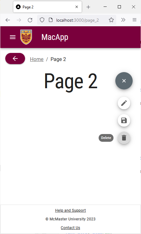
Save the file and go back to your browser. Navigate to “Page 2” and you will see the MacSpeedDial that we just added. Hovering over the speed dial will turn it grey and show the options defined in the actions array.
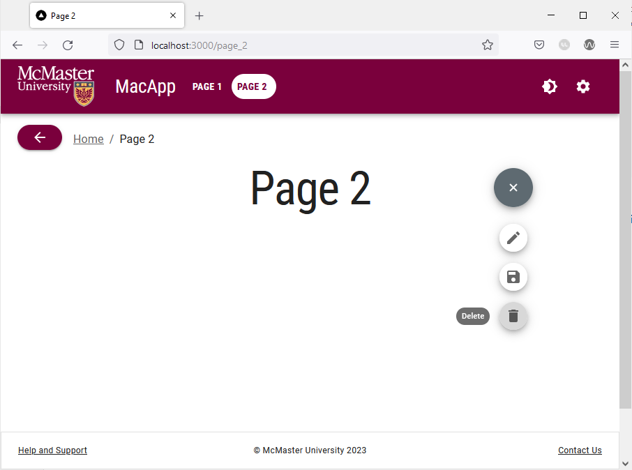
On small screens, the speed dial remains in the top right corner as shown in the screenshot below.