Footer
A website’s footer typically contains copyright notices, disclaimers, and links to a support page, contact form or social media accounts. Keeping the footer pinned at the bottom of the screen regardless of the user’s current position on the page may be desirable on large displays. However, on small screens the footer should only be visible when the user scrolls to the bottom of the page. In this section, we will learn how to modify a footer’s position depending on the screen size.
Modify the Footer Position
Open the components/Footer/Footer.tsx file and locate the Paper component inside the return statement. Notice that the position prop is set to fixed , which is why the footer is always visible at the bottom of the page. We will modify this prop to be set conditionally depending on the screen size using the MUI breakpoints API. MUI offers 5 default breakpoints that can be modified if needed. Each breakpoint (a key) matches with a fixed screen width (a value):
- xs, extra-small: 0px
- sm, small: 600px
- md, medium: 900px
- lg, large: 1200px
- xl, extra-large: 1536px
For the purposes of this workshop, we will only be using the xs and md breakpoints to create two distinct user interfaces for mobile devices (xs) and desktop or laptop monitors (md).
Add the following import statement to Footer.tsx:
import {useTheme} from "@mui/material/styles";
Delete the position: 'fixed' line in the sx prop of the Paper component and replace it with the following lines of code:
// the position is relative on xs and sm screens
[useTheme().breakpoints.between('xs', 'md')]: {
	position: 'relative',
},
// the position is fixed on screen that are md or larger
[useTheme().breakpoints.up('md')]: {
	position: 'fixed',
},
We set the footer position to relative on screen size between small (inclusive) and medium (non-inclusive), whereas the position is set to fixed on screens that are medium or larger.
Modify the Footer Height
Similarly, we will need to reduce the height of the footer on small screens by adding the following lines of code inside the sx prop of the Paper component:
// setting the footer height to 93 on xs and sm screens
[useTheme().breakpoints.between('xs', 'md')]: {
	height: '93',
},
Try shrinking your browser window and notice how the footer will automatically be moved to the bottom when the browser window is small enough.
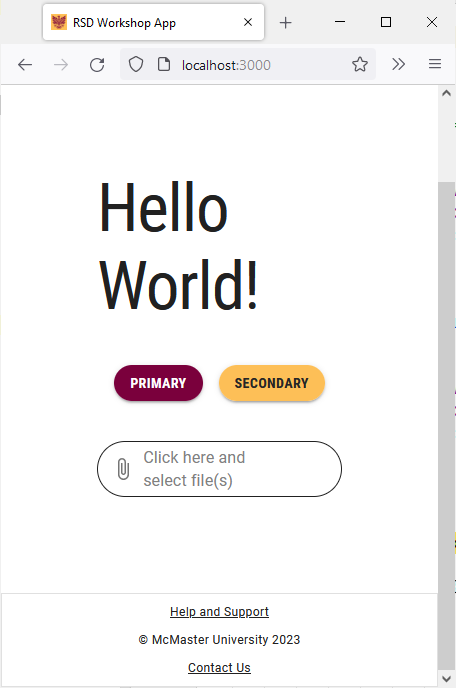
Modify the Footer Content Placement
The copyright information and the links are not positioned properly on small screens since there isn’t enough horizontal space. We will limit the current footer layout to medium and large displays and use a Stack component to position the copyright information and links vertically on small screens.
Replace the display: 'flex' line inside the sx prop of the Box and the first two Grid components with display: {xs: 'none', md: 'flex'} as shown below:
<Box
	sx={{
		flexGrow: 1,
		justifyContent: 'center',
		// only show this component on md screens
		display: {xs: 'none', md: 'flex'},
		my: 1,
	}}
></Box>
<Grid item xs={12} sm={6} md={3} sx={{display: {xs: 'none', md: 'flex'}}}></Grid>
<Grid
	sx={{
		flexGrow: 1,
		justifyContent: 'space-between',
		// only show this component on md screens
		display: {xs: 'none', md: 'flex'}
	}}
	container
	spacing={2}
Add the following import statement to Footer.tsx:
import Stack from "@mui/material/Stack";
Add the following lines of code to before the closing </Container> tag:
<Stack
	direction="column" // the components inside Stack will be stacked vertically
	justifyContent="space-between"
	alignItems="center"
	spacing={1}
	// only show this component on xs screens
	sx={{display: {xs: 'flex', md: 'none'}}}
>
	<Box
		sx={{
			flexGrow: 1,
			justifyContent: 'flex-start',
			display: 'flex',
			alignItems: 'flex-start',
			mt: 1
		}}
>
		<Typography
			component={Link}
			href="/support"
			variant="caption"
			color="inherit"
>
			Help and Support
		</Typography>
	</Box>

	<Box
		sx={{
			flexGrow: 1,
			justifyContent: 'center',
			display: 'flex',
		}}
>
		<Typography variant="caption" color="inherit">
			© McMaster University {new Date().getFullYear()}
		</Typography>
	</Box>

	<Box
		sx={{
			flexGrow: 1,
			justifyContent: 'flex-end',
			display: 'flex',
			alignItems: 'flex-end',
		}}
>
		<Typography
			component={Link}
			href="mailto: example@mcmaster.ca"
			variant="caption"
			color="inherit"
			sx={{mb: 1}}
>
			Contact Us
		</Typography>
	</Box>
</Stack>
Save the file and go back to your browser. Try changing the browser window width and notice how the footer changes.
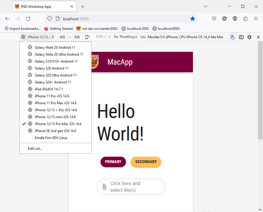
Most browsers include a development tool that allows you to simulate a number of mobile devices to ensure that your website renders properly on these devices. You can simulate a mobile device by using one of the methods below:
- Firefox:
- Right-click on page > Inspect Element > Click the Toggle Device icon

- Alternatively, you can use the Ctrl + Shift + M (Windows) or Cmd+Opt+M (Mac) keyboard shortcut to toggle the mobile device view.
- Right-click on page > Inspect Element > Click the Toggle Device icon
- Chrome:
- Right-click on page > Inspect > Click the Toggle Device icon
- Alternatively, you can use the Ctrl + Shift + M (Windows) or Cmd+Opt+M (Mac) keyboard shortcut to toggle the mobile device view.
- Right-click on page > Inspect > Click the Toggle Device icon
You can then select the desired mobile device from the dropdown menu in the top right corner of the screen: