Navigation Bar
We have already styled the navigation bar in our SPA. However, the current design does not scale properly on smaller displays. We will modify the navigation bar to make use of the MUI Drawer component on smaller screens.
Limit Current Configuration to Medium (or Larger) Displays
We will start by limiting the current navigation bar setup to medium and large display using breakpoints.
Open the components/Navbar/Navbar.tsx file and replace all the existing display: 'flex' lines with display: {xs: 'none', md: 'flex'}.
Add a Drawer
Start by adding the following import statements to Navbar.tsx:
import Drawer from "@mui/material/Drawer";
import List from "@mui/material/List";
import ClearIcon from '@mui/icons-material/Clear';
import ListItem from "@mui/material/ListItem";
import ListItemButton from "@mui/material/ListItemButton";
import ListItemIcon from "@mui/material/ListItemIcon";
import ListItemText from "@mui/material/ListItemText";
import LooksOneIcon from '@mui/icons-material/LooksOne';
import LooksTwoIcon from '@mui/icons-material/LooksTwo';
import MenuIcon from '@mui/icons-material/Menu';
Next, add the following lines of code before the return statement:
// declaring a state variable that determines if the drawer is open and initializing it to false
const [state, setState] = React.useState(false);

 // function used to open and close the navigation drawer
const toggleDrawer =
	(open: boolean) =>
		(event: React.KeyboardEvent | React.MouseEvent) => {
			if (
				event.type === 'keydown' &&
				((event as React.KeyboardEvent).key === 'Tab' ||
					(event as React.KeyboardEvent).key === 'Shift')
			) {
				return;
			}
			setState(open);
		};

 // array containing the icons used for Page 1 and Page 2 in the navigation drawer
const icons = [<LooksOneIcon key={'page-1'} />, <LooksTwoIcon key={'page-2'}/>]

// function used to render the items inside the drawer
const pages_drawer = () => (
	<Box
		paddingTop={1}
		sx={{ width:  250 }}
		role="presentation"
		onKeyDown={toggleDrawer(false)}
>
		<List>
			{/* iterating over the pages array and rendering a ListItem for each page */}
			{pages.map((page, index) => (
				<ListItem key={page[0]} disablePadding>
					<ListItemButton onClick={toggleDrawer(false)} component={Link} href={page[1]} selected= {currentRoute === page[1]} >
						<ListItemIcon>
							{icons[index]}
						</ListItemIcon>
						<ListItemText primary={page[0]} />
					</ListItemButton>
				</ListItem>
			))}
		</List>
		{/* rendering the light/dark mode toggle and setting button at the bottom of the drawer */}
		<List style={{ position: "absolute", bottom: "0", right: "0", left: "0"}}>
			<ListItem key={'mode'} disablePadding>
				<ListItemButton onClick={colorMode.toggleColorMode}
								color="inherit" >
					<ListItemIcon>
						{theme.palette.mode === 'dark' ? (
							<Brightness7Icon />
						) : (
							<Brightness4Icon />
						)}
					</ListItemIcon>
					<ListItemText primary={theme.palette.mode === 'dark'
						? 'Switch to Light Mode'
						: 'Switch to Dark Mode'} />
				</ListItemButton>
			</ListItem>
			<ListItem key={'settings'} disablePadding>
				<ListItemButton onClick={toggleDrawer(false)} component={Link} href={'/settings'} selected= {currentRoute === '/settings'} color="inherit" >
					<ListItemIcon>
						<SettingsIcon />
					</ListItemIcon>
					<ListItemText primary={'Settings'} />
				</ListItemButton>
			</ListItem>
		</List>
	</Box>
);
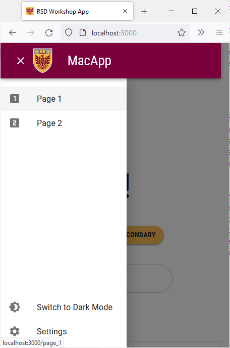
The toggleDrawer function handles opening and closing the drawer using the state constant. The pages_drawer function renders the components inside the drawer. The drawer contains the “Page 1” and “Page 2” buttons at the top along with the light/dark mode toggle and the settings button at the bottom.
We will now add the UI elements that should only be visible on smaller screens. We will add a MacIconNavButton to open and close the drawer. We will also use a smaller version of the McMaster logo that only contains the emblem.
Add the following lines of code right after the Toolbar opening tag inside the return statement:
{/* the contents of this box will only be shown on mobile devices */}
<Box sx={{flexGrow: 1, display: {xs: 'flex', md: 'none'}}}>
	<Tooltip enterDelay={500} title={state ? "Close App Drawer" : "Open App Drawer"}>
		{/* adding an icon button to open/close the drawer */}
		<MacIconNavButton
			size="large"
			aria-controls="menu-appbar"
			aria-haspopup="true"
			onClick={toggleDrawer(!state)}
			color="inherit"
>
			{state ? <ClearIcon /> : <MenuIcon />}
		</MacIconNavButton>
	</Tooltip>
	<Drawer
		anchor={"left"}
		open={state}
		onClose={toggleDrawer(false)}
		sx={{
			'& .MuiDrawer-root': {
				position: 'absolute'
			},
			'& .MuiPaper-root': {
				position: 'absolute',
				borderRadius: 0
			},
			minWidth: 100,
			width: "20%",
			position: "absolute",
			top: '70px',
			display: {xs: 'flex', md: 'none'}
		}}
>
		{pages_drawer() /*calling pages_drawer() to render the content of the drawer */}
	</Drawer>
	<Box
		justifyContent="center"
		alignItems="center"
		sx={{alignItems: 'center', display: {xs: 'flex', md: 'none'}}}
	>
		{/* rendering the small emblem version of the McMaster logo */}
		<Box
			component="img"
			sx={{
				height: 70,
				width: '100%',
			}}
			alt="McMaster Logo"
			src="/assets/logo-small.png"
			style={imgStyle}
		/>
		<Typography
			variant="h3"
			component={Link}
			href="/"
			sx={{
				mr: 2,
				flexGrow: 1,
				color: 'inherit',
				textDecoration: 'none',
				"&:hover": {
					color: useTheme().palette.secondary.main
				}
			}}
>
			MacApp
		</Typography>
	</Box>
</Box>
All these new components are only visible on small screens (due to the display prop being set to {xs: 'flex', md: 'none'}). Notice how the icon in the navigation bar changes depending on whether the drawer is open or closed. The content of the drawer is rendered using the pages_drawer() function.
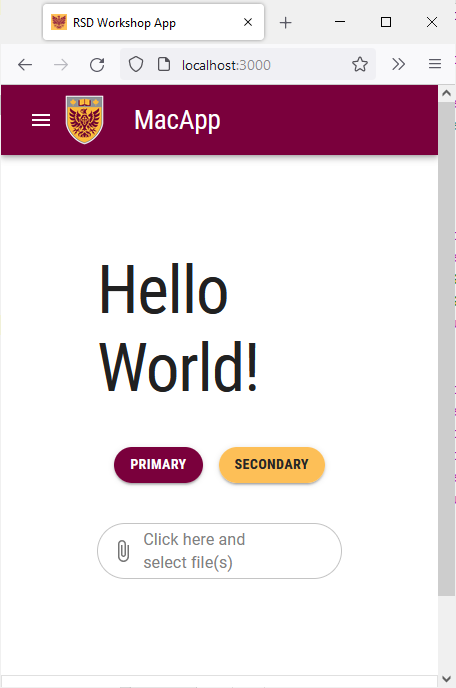
Save the file and go back to your browser. Try shrinking the window and notice how the navigation bar now has a drawer and a smaller logo.