Interactive UI Elements
Modern websites require the use of UI elements that not only allow the user to perform a wide range of functions, but also react to the user’s actions in an intuitive manner. In this section, we will learn how to style certain MUI components to conform to the stylistic guidelines set by McMaster Digital Brand Standards Manual.
Buttons
Create a Styled MacButton Component
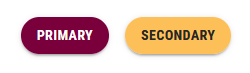
We will start by creating a styled MacButton component based on the standard MuiButton button. We will add a mainColor prop to the MacButton component that will determine the background color, text color and hover color of the button. If the mainColor prop is 'primary', then the background color will be Heritage Maroon, the text color will be white and the button will turn a medium shade of grey when the user hovers over it as required by the McMaster Digital Brand Standards guide. On the other hand, if the mainColor prop is 'secondary', then the background color will be Heritage Gold, the text color will be dark grey and the button will turn light grey when the user hovers the mouse over it.
Create a MacButton.tsx file in the components/MacComponents directory and add the following lines of code to it:
import {useTheme} from '@mui/material/styles'
import styled from '@emotion/styled'
import MuiButton, {ButtonProps} from '@mui/material/Button'

// extending the ButtonProps with a mainColor prop of type string
interface MacButtonProps extends ButtonProps {
    mainColor: string
}

export const MacButton = styled(MuiButton, {shouldForwardProp: (prop) => prop !== "mainColor"})<MacButtonProps>(props => ({
    // if mainColor is secondary, the button background color should be heritage gold (i.e., the secondary color in our theme)
    // otherwise, the button background color should be heritage maroon (i.e., the primary color in our theme)
    backgroundColor: props.mainColor === 'secondary' ? useTheme().palette.secondary.main:  useTheme().palette.primary.main,
    // if mainColor is secondary, the button text color should be dark gray
    // otherwise, the button text color should be white
    color: props.mainColor === 'secondary' ? '#262626':  '',

    // setting the hover behavior of MacButton
    ':hover': {
        // if mainColor is secondary, the button should turn light gray (#DBDBDD) when hovering over it
        // otherwise, the button should turn dark gray (#5E6A71) when hovering over it
        backgroundColor: props.mainColor === 'secondary' ? '#DBDBDD':'#5E6A71',
    },
}));
Update the Buttons on the Main Page
We will now update the buttons on the main index page to use the newly created MacButton component instead of the standard MUI Button component.
Open the app/page.tsx file and replace the Button import statement with following import statement:
import {MacButton} from '@/components/MacComponents/MacButton'
Locate the two Button components and modify them as shown below:
<MacButton
	variant="contained"
	mainColor="primary"
	onClick={handleClick('Primary Button Clicked!')}
>
	Primary
</MacButton>
<MacButton
	variant="contained"
	mainColor="secondary"
	onClick={handleClick('Secondary Button Clicked!')}
>
	Secondary
</MacButton>
Notice how we used the mainColor prop to determine the color of the button and its hover behavior.
Save the file and go back to your browser. The buttons on the main page should now look like this:
Try hovering over each button and notice how they change color.
| Hovering Over Primary Button | Hovering Over Secondary Button |
|---|---|
 |  |
Update the Back Button on the BreadCrumbs component
Open the components/BreadCrumbs/BreadCrumbs.tsx file and replace the Button import statement with following import statement:
import {MacButton} from '@/components/MacComponents/MacButton'
Locate the Button component and modify it as shown below:
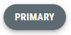
<MacButton variant="contained" mainColor="primary" onClick={() => router.back()}>
	<ArrowBackIcon />
</MacButton>
Save the file and navigate to “Page 1” in your browser. Try hovering over the back and notice how it turns grey.
Buttons With a Dropdown Menu
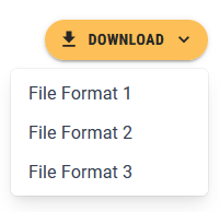
The styled MacButton that we created earlier can be combined with a dropdown menu to create a button that allows the user to execute mutually exclusive functions that fall under the same category e.g., a download button that lets the user choose the file format. Our SPA already has a regular MUI Button with a dropdown menu on “Page 1”. We will update the button to use the the secondary variant of the MacButton component.
Open page_1/page.tsx and replace the Button import statement with following import statement:
import {MacButton} from '@/components/MacComponents/MacButton'
Locate the “Download” Button component and change it to use the MacButton component as shown below:
<MacButton
	id="download-button"
	sx={{
		position: 'fixed',
		top: 20,
		right: 10,
		zIndex: 2000,
		display: 'flex'
	}}
	aria-controls={
		openMenu ? 'download-menu' : undefined
	}
	aria-haspopup="true"
	aria-expanded={openMenu ? 'true' : undefined}
	variant="contained"
	onClick={handleClickMenu}
	startIcon={<DownloadIcon />}
	endIcon={<KeyboardArrowDownIcon />}
	mainColor="secondary"
>
	Download
</MacButton>
The styled download button will look like this:
Speed Dials
Material UI offers a SpeedDial component that allows developers to create a floating action button, which can display related actions. The SpeedDial component is often used to group action that manipulate the state of an object e.g., “edit”, “delete”, and “save”. We will now learn how to create a styled SpeedDial component that adheres to the McMaster Branding Standards.
Create a MacSpeedDial.tsx file in the components/MacComponents directory and add the following lines of code to it:
import {useTheme} from '@mui/material/styles'
import styled from '@emotion/styled'
import SpeedDial, {SpeedDialProps} from '@mui/material/SpeedDial'

// extending the SpeedDialProps with a mainColor prop of type string
interface MacSpeedDialProps extends SpeedDialProps {
    mainColor: string
}

export const MacSpeedDial = styled(SpeedDial, {shouldForwardProp: (prop) => prop !== "mainColor"})<MacSpeedDialProps>(props => ({
    '& .MuiFab-primary': {
        // if mainColor is secondary, the speed dial background color should be heritage gold (i.e., the secondary color in our theme)
        // otherwise, the speed dial background color should be heritage maroon (i.e., the primary color in our theme)
        backgroundColor: props.open
            ? props.mainColor === 'secondary'
                ? '#DBDBDD'
                : '#5E6A71'
            : props.mainColor === 'secondary'
                ? useTheme().palette.secondary.main
                : useTheme().palette.primary.main,
        // if mainColor is secondary, the speed dial text color should be dark gray
        // otherwise, the speed dial text color should be white
        color: props.mainColor === 'secondary' ? '#262626' : '',

        // setting the hover behavior of MacSpeedDial
        '&:hover': {
            // if mainColor is secondary, the speed dial should turn light gray (#DBDBDD) when hovering over it
            // otherwise, the speed dial should turn dark gray (#5E6A71) when hovering over it
            backgroundColor:
                props.mainColor === 'secondary' ? '#DBDBDD' : '#5E6A71',
        },
    },
}))
We added a mainColor prop to the MacSpeedDial component that will determine the background color, text/icon color and hover color of the button. Akin to the MacButton component, if the mainColor prop is 'primary', then the background color will be Heritage Maroon, the text/icon color will be white and the speed dial will turn a medium shade of grey when the user hovers over it as required by the McMaster Digital Brand Standards guide. Otherwise, if the mainColor prop is 'secondary', then the background color will be Heritage Gold, the text/icon color will be dark grey and the button will turn light grey when the user hovers the mouse over it.
We will now use the MacSpeedDial component on “Page 2”. Open the app/page_2/page.tsx file and add the following import statement:
import {MacSpeedDial} from '@/components/MacComponents/MacSpeedDial'
You can remove SpeedDial from the following import statement import {SpeedDial, SpeedDialAction, SpeedDialIcon} from "@mui/material";
Replace the SpeedDial component with a MacSpeedDial component and add the mainColor prop as shown below:
<MacSpeedDial
	ariaLabel="Demo SpeedDial"
	sx={{
		position: 'fixed',
		top: 10,
		right: 10,
		zIndex: 2000,
	}}
	icon={<SpeedDialIcon />}
	onClose={handleCloseSD}
	onOpen={handleOpenSD}
	open={openSD}
	direction="down"
	mainColor="primary"
>
	{actions.map(action => (
		<SpeedDialAction
			key={action.name}
			icon={action.icon}
			tooltipTitle={action.name}
			onClick={action.action}
		/>
	))}
</MacSpeedDial>
Save the file and navigate to “Page 2” in your browser. The Speed Dial will now turn grey when you hover over it:

Dropdown Menu
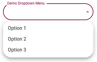
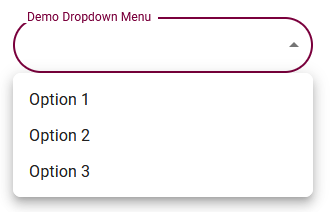
Dropdown menus allow the user to select an option from a given list. Material UI provides a Select component that can be used to generate dropdown menus. The “Settings” page of our SPA already has a dropdown menu with rounded corners (due to the shape property set in theme.ts). However, the list of options that appears when you click on the dropdown menu has rounded corners that could potentially clip text. We will need to reduce the border radius of the MuiPaper component to address this concern.
Open config/theme.ts and add the following lines of code after the shape definition (make sure there is a comma after the shape definition):
components: {
	// overwriting the border radius for the MuiPaper component (used in dropdown menus)
	MuiPaper: {
		styleOverrides: {
			root: {
				borderRadius: 8,
			},
		},
	},
}
| Original Dropdown Menu | Styled Dropdown Menu |
|---|---|
 |  |