Vertical Tabs
The vertical tabs we created for the “Settings” page do not scale properly on mobile devices. We will modify the VerticalTabs component to use a small drawer for switching tabs on the “Settings” page when viewed on a small screen.
Limit Current Configuration to Medium (or Larger) Displays
We will start by limiting the current tabs setup to medium and large display using breakpoints.
Open the components/TabPanel/VerticalTabs.tsx file and replace the display: 'flex' line inside the Tabs component with display: {xs: 'none', md: 'flex'}.
Add Drawer
Start by adding the following import statements to VerticalTabs.tsx:
import Drawer from '@mui/material/Drawer';
import List from '@mui/material/List';
import ListItem from '@mui/material/ListItem';
import ListItemButton from '@mui/material/ListItemButton';
import ListItemIcon from '@mui/material/ListItemIcon';
import ListItemText from '@mui/material/ListItemText';
import FormatListBulletedOutlinedIcon from '@mui/icons-material/FormatListBulletedOutlined';
import IconButton from "@mui/material/IconButton";
Next, add the following lines of code before the return statement:
// function that handles changing tabs in the tabs drawer
const handleChangeDrawer = (e: React.MouseEvent<HTMLDivElement>, newValue: number) => {
	setValue(newValue);
}

// declaring a state variable that determines if the tabs drawer is open and initializing it to false
const [state, setState] = React.useState(false);

// function used to open and close the tabs drawer
const toggleDrawer =
	(open: boolean) =>
		(event: React.KeyboardEvent | React.MouseEvent) => {
			if (
				event.type === 'keydown' &&
				((event as React.KeyboardEvent).key === 'Tab' ||
					(event as React.KeyboardEvent).key === 'Shift')
			) {
				return;
			}
			setState(open);
		};

// function used to render the items inside the tabs drawer
const list = () => (
	<Box
		sx={{ width:  250 }}
		role="presentation"
		onClick={toggleDrawer(false)}
		onKeyDown={toggleDrawer(false)}
>
		<List>
			{tabs.map((text, index) => (
				<ListItem key={text} disablePadding>
					<ListItemButton selected= {value === index} onClick={(e) => handleChangeDrawer(e, index)}>
						<ListItemIcon>
							{icons[index]}
						</ListItemIcon>
						<ListItemText primary={text} />
					</ListItemButton>
				</ListItem>
			))}
		</List>
	</Box>
);
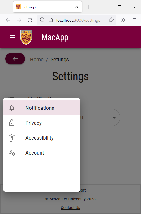
The toggleDrawer function handles opening and closing the drawer using the state constant. The list function renders the components inside the drawer. Akin to the Tabs component, the drawer contains four tabs with appropriate iconography. The selected= {value === index} line in the ListItemButton component is used to highlight the tab that the user currently has open by comparing the value prop of the TabPanel component to the index of the tab.
We will now add the UI elements that should only be visible on smaller screens. We will add an IconButton to open and close the Drawer component.
Add the following lines of code right after the Tabs closing tag inside the return statement:
{/* adding an icon button to open/close the drawer on mobile devices */}
<Box sx={{paddingTop: '19px'}}>
	<IconButton title="Settings Drawer" aria-label="settings-menu" onClick={toggleDrawer(true)} sx={{ display: {xs: 'inline', md: 'none'}, height:'40px'}}> <FormatListBulletedOutlinedIcon /> </IconButton>
</Box>
{/* rendering the Drawer component */}
<Drawer
	anchor={"left"}
	open={state}
	onClose={toggleDrawer(false)}
	sx={{
		'& .MuiDrawer-root': {
			position: 'absolute'
		},
		'& .MuiPaper-root': {
			position: 'absolute'
		},
		minWidth: 100,
		width: "20%",
		position: "absolute",
		top: '230px',
		left: '2%',
		height: '50%',
		display: {xs: 'flex', md: 'none'}
	}}
>
	{list() /* calling list() to render the content of the tabs drawer */}
</Drawer>
We will also add a title to each panel that is only visible on small screens since the tab names are no longer visible when the user is on each tab.
Modify each TabPanel component by adding a Typography component to it and only displaying it on small screens using breakpoints:
<TabPanel value={value} index={0}>
	{/* adding a Typography component with the title of the active tab (only visible on small screens) */}
	<Typography
		sx={{display: {xs: 'flex', md: 'none'}, justifyContent: 'left', paddingLeft: '10px'}}
		variant="h3"
		gutterBottom
>
		Notifications
	</Typography>
	<FormControl sx={{m: 1, minWidth: 300}}>
		<InputLabel id="demo-simple-select-label">
			Demo Dropdown Menu
		</InputLabel>
		<Select
			labelId="demo-simple-select-label"
			id="demo-simple-select"
			label="Demo Dropdown Menu"
>
			<MenuItem value={1}>Option 1</MenuItem>
			<MenuItem value={2}>Option 2</MenuItem>
			<MenuItem value={3}>Option 3</MenuItem>
		</Select>
	</FormControl>
</TabPanel>
<TabPanel value={value} index={1}>
	<Typography
		sx={{display: {xs: 'flex', md: 'none'}, justifyContent: 'left', paddingLeft: '10px'}}
		variant="h3"
		gutterBottom
>
		Privacy
	</Typography>
	Placeholder 2
</TabPanel>
<TabPanel value={value} index={2}>
	<Typography
		sx={{display: {xs: 'flex', md: 'none'}, justifyContent: 'left', paddingLeft: '10px'}}
		variant="h3"
		gutterBottom
>
		Accessibility
	</Typography>
	Placeholder 3
</TabPanel>
<TabPanel value={value} index={3}>
	<Typography
		sx={{display: {xs: 'flex', md: 'none'}, justifyContent: 'left', paddingLeft: '10px'}}
		variant="h3"
		gutterBottom
>
		Account
	</Typography>
	Placeholder 4
</TabPanel>
Notice that we used a custom Typography variant that we defined earlier in theme.ts for these titles.
Save the file and go back to your browser. Try shrinking the window and notice how the tabs are replaced with a drawer.
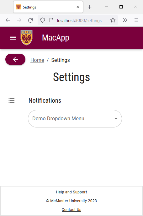
We also retain an active indicator to inform the user of the current tab that they are on.