Navigation Bar
We will now update our navigation bar to ensure that it adhere to the McMaster Digital Brand Standards and properly communicates to the user which buttons are clickable and which page they are currently on:
Create Navbar.module.css
In the styles directory of your project, create a new file called Navbar.module.css. This file will contain the CSS styles used for the links in our navigation bar. We will define the colors of the links in their active, non-active and hover states:
- Non-active links should be white and turn Heritage Gold when you hover over them.
- Active links should have a white background and the link text should be Heritage Maroon.
Add the following lines to Navbar.module.css:
/* Specific styles for non-active navbar links */
.nonActive {
    color: white;
}

/* Specific styles for active navbar links */
.active {
    color: #7a003c;
    background: white;
}

/* Specific styles when hover over active navbar links */
.active:hover {
    color: #7a003c;
    background: white;
}
Create Styled Buttons and Icon Buttons
We will now created styled buttons and icon buttons for use in our navigation bar.
Create a new directory called MacComponents inside the components directory. Create a new file in this directory called MacNavButton.tsx and add the following code to it:
import {styled, useTheme} from '@mui/material/styles'
import Button from '@mui/material/Button'
import IconButton from '@mui/material/IconButton'

export const MacNavButton = styled(Button)(props => ({
    // setting the navigation button behavior when hovering over them
    ':hover': {
        // the background should be transparent when hovering over a navigation button
        backgroundColor: "transparent",
        // the text should be heritage gold (the secondary color in the theme)
        color: useTheme().palette.secondary.main,
    },
    // changing the color of the ripple and setting to a light grey
    '&& .MuiTouchRipple-child': {
        backgroundColor: "#D6D6D6",
    },
})) as typeof Button

export const MacIconNavButton = styled(IconButton)(props => ({
    // setting the navigation icon button behavior when hovering over them
    ':hover': {
        // the background should be transparent when hovering over a navigation icon button
        backgroundColor: "transparent",
        // the icon should be heritage gold (the secondary color in the theme)
        color: useTheme().palette.secondary.main,
    },
    '&& .MuiTouchRipple-child': {
        // changing the color of the ripple and setting to a light grey
        backgroundColor: "#D6D6D6",
    },
})) as typeof IconButton
We set the hover color to Heritage Fold and made the background transparent when hovering over the icon button. We also added a ripple affect to the buttons that appears when the user clicks on them.
Update Navbar.tsx
Open the components/Navbar/Navbar.tsx file and add the following import statements:
import styles from '@/styles/NavBar.module.css'
import {MacIconNavButton, MacNavButton,} from '@/components/MacComponents/MacNavButton'
Next, we will add the McMaster logo to the left-hand side of the navigation bar. Add the following lines of code before the Typography component containing the “MacApp” string:
<Box
	component="img"
	sx={{
		height: 78.31,
		width: 140,
		display: 'flex'
	}}
	alt="McMaster Logo"
	src="/assets/logo.png"
	style={imgStyle}
/>
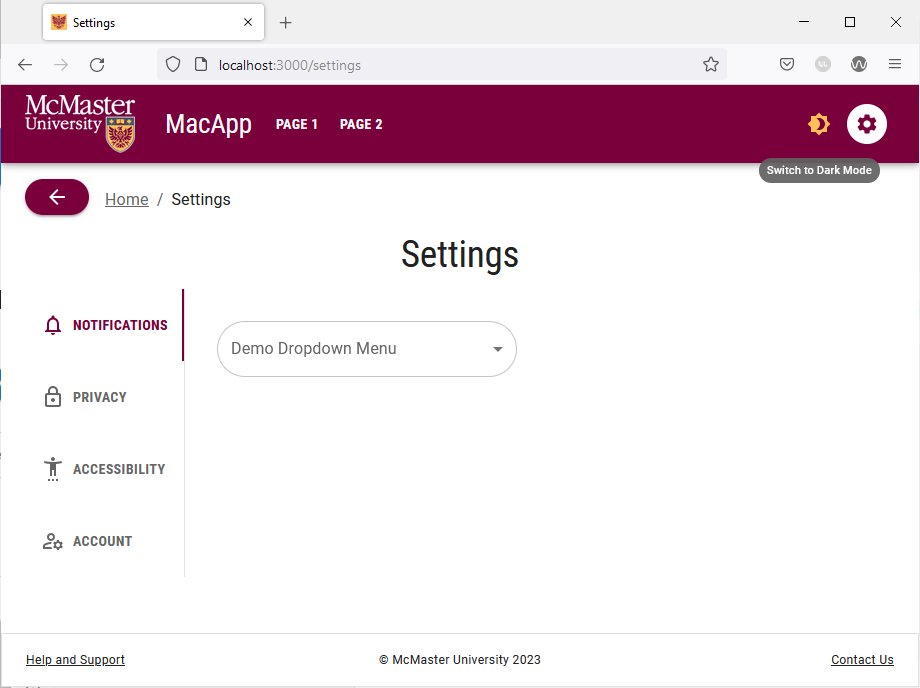
Your navigation bar will now look like this:
Update the Typography component containing the “MacApp” string by changing the variant from h3 to h5 and defining the hover behavior inside the sx prop. The typography component should now look like this:
<Typography
	variant="h3"
	noWrap
	component={Link}
	href="/"
	sx={{
		mr: 2,
		display: 'flex',
		textDecoration: 'none',
		color: 'inherit',
		// changing the color of the text to heritage gold when hovering over it
		"&:hover": {
			color: useTheme().palette.secondary.main
		}
	}}
>
	MacApp
</Typography>
| Old “MacApp” Title | Styled “MacApp” Title |
|---|---|
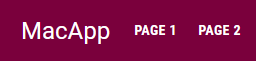 |  |
Try hovering over the “MacApp” title in your browser, the text should turn Heritage Gold to indicate that it is a clickable link as shown in the image below.

We will now update the page links in the navigation to change color when the user hovers over them and have an active indicator. Inspect the Box component after the the Typography component containing the “MacApp” string. Notice that the page links are rendered using the standard MUI Button component. We will modify the page links to use the custom MacNavButton component that we created earlier instead of the standard MUI Button component as shown in the code snippet below:
<Box sx={{flexGrow: 1, display: 'flex'}}>
	{pages.map(page => (
		<MacNavButton
			key={page[0]}
			component={Link}
			href={page[1]}
			sx={{mx: 0.3, my: 2, color: 'white', display: 'block'}}
			// if the current route equals the URL associated with the button,
			// then use the active style. Otherwise, use the inactive style
			className={
				currentRoute === page[1]
					? styles.active
					: styles.nonActive
			}
>
			{page[0]}
		</MacNavButton>
	))}
</Box>
We also conditionally set the className prop to display a white oval-shaped background on the button corresponding to the current active page.
Similarly, we will update the icon buttons in the navigation bar to use the aforementioned hover and active styles.
Locate the IconButton component containing the <Brightness7Icon /> and <Brightness4Icon /> components and change it to a MacIconNavButton component as show below:
<MacIconNavButton
	sx={{ml: 1}}
	color="inherit"
>
	{theme.palette.mode === 'dark' ? (
		<Brightness7Icon />
	) : (
		<Brightness4Icon />
	)}
</MacIconNavButton>
Next, change the IconButton component containing the <SettingsIcon /> component to a MacIconNavButton controller and add the classNames prop:
<MacIconNavButton
	aria-label="settings"
	color="inherit"
	component={Link}
	href="/settings"
	className={
		// if the current route equals '/settings',
		// then use the active style. Otherwise, use the inactive style
		currentRoute === '/settings'
			? styles.active
			: styles.nonActive
	}
>
	<SettingsIcon />
</MacIconNavButton>
The icon buttons in the navigation bar will now turn Heritage Gold when you hover over them. The settings page will also have an active indicator when you are on this page.