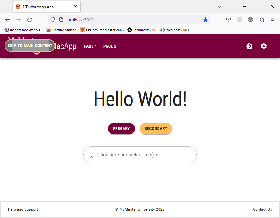
“Skip to Main Content” Button
Many modern websites have a consistent set of UI elements at top of every page. The content commonly includes a header with the brand logo and a navigation bar. If a user navigates the same site regularly, they will probably find themselves navigating through these UI elements regularly to get to the main content on the page, which can be tedious and detrimental to the overall user experience. As such, developers started adding a “Skip to Main Content” button to their webpages. These anchor buttons are meant to be used as the first element that a user can tab to when they first load a webpage. In this section, we will learn how to add a “Skip to Main Content” button to our Next.js application.
Create SkipLink and SkipButton Components
We will start by creating the custom components needed to render the “Skip to Main Content” button.
Create a SkipLink directory inside the components directory. Next, create a SkipLink.tsx file inside the SkipLink directory and add the following lines of code to it:
import React from 'react';

interface SkipLinkProperties {
    className?: string;

    children: React.ReactElement;
    /**
     * The css query aiding the selection of the
     * container (main, section etc) we want to scroll to;
     */
    skipTo: string;
}

const SkipLink: React.FC<SkipLinkProperties> = props => {

    const onClick = (event: React.SyntheticEvent) => {
        event.preventDefault();

        const container: (HTMLElement | null) = document.querySelector(props.skipTo);

        if (container) {
            container.tabIndex = -1;
            container.focus();
            setTimeout(() => container.removeAttribute("tabindex"), 1000);
        }
    };

    return React.cloneElement(props.children, { onClick, className: props.className });
}

export default SkipLink;
We created a re-usable component that encapsulates the desired “Skip to Main Content” functionality. SkipLink.tsx includes an onClick event handler that will be forwarded to any children component nested inside the SkipLink component. The className prop of the SkipLink is used to specify the CSS class and a SkipTo string containing the CSS query used to determine which component we want to skip to.
Our next step is to create a custom SkipButton component that we will nest inside the SkipLink component.
Create a SkipButton.tsx file inside the SkipLink directory and add the following lines of code to it:
import {useTheme} from '@mui/material/styles'
import styled from '@emotion/styled'
import MuiButton, {ButtonProps} from '@mui/material/Button'

interface SkipButtonProps extends ButtonProps {
    mainColor: string
}

export const SkipButton = styled(MuiButton, {
    shouldForwardProp: prop => prop !== 'mainColor',
})<SkipButtonProps>(props => ({
    backgroundColor: useTheme().palette.secondary.main, // using the secondary color (heritage gold) as the background color
    color: '#262626', // setting the text color to black
    // styles used when the button is in focus
    "&:focus-visible": {
        color: 'white', // the text color should be white
        backgroundColor: '#707070', // the background is grey
        outline: '2px solid #fdbf57', // the outline is a 2px solid heritage gold line
    },
}))
We customized the color and focus behavior of the SkipButton component to ensure that the focus indicator is visible against the navigation bar.
We will be making use of Sass (Syntactically Awesome Stylesheet), which is an extension of CSS, to ensure that the SkipLink components slides on the screen from the left-hand side.
Start by installing the sass package using npm:
npm i sass
Next, add the Sass styles for the SkipLink component by creating a SkipLink.module.scss file inside the styles directory.
Add the following lines of code SkipLink.modukle.scss:
// placing the button in the top-right corner and addition a transition animation (sliding)
.skipLink {
  margin-right: 1rem !important;
  position: absolute !important;
  transform: translateX(-200%) !important;
  transition: transform 0.3s !important;

  &:focus {
    position: absolute !important;
    transform: translateX(0) !important;
  }
}
Finally, we will make use of the SkipLink and SkipButton components in the navigation bar. Open the Navbar/Navbar.tsx file located inside the components directory and add the following import statements:
import SkipLink from "@/components/SkipLink/SkipLink";
import {SkipButton} from "@/components/SkipLink/SkipButton";
import styles_skip from '@/styles/SkipLink.module.scss'
Add the following lines of code before the <Container maxWidth="xl"> line:
{/* setting the zIndex to 1300 to ensure that the button always renders on top of other component */}
<Box sx={{zIndex: 1300}}>
	<SkipLink className={styles_skip.skipLink} skipTo={"main:first-of-type"}>
		<SkipButton mainColor={"primary"} sx={{marginTop:2.4, marginLeft:2, color: 'white'}}>Skip to main content</SkipButton>
	</SkipLink>
</Box>
The Box containing the “Skip to Main Content” button has the zIndex property set to 1300 to ensure that the button always renders on top of other components. We set the className prop of the SkipLink component to the style defined in the SkipLink.modue.scss file. The skipTo string is set to "main:first-of-type", i.e., we want to skip to the first component that has main as its class.
Save the file and go back your browser, then reload the page. If you encounter errors, simply stop the current running dev instance by going to the terminal and clicking “Ctrl + C”, then “Y” to confirm.
Once the page is loaded, try pressing the Tab key on your keyboard. The “Skip to Main Content” button should slide from the left-hand side of the navigation bar.

Try pressing the “Enter” key on your keyboard when the “Skip to Main Content” button is shown. You can then press “Tab” again to navigate the main content of the page without going through the navigation bar buttons.