Typography
We will now learn how to use custom fonts and typography styles in a web application. McMaster recommends the use of the Roboto family of fonts on all websites associated with the university, so we will import and use these fonts as an example. To add the Roboto family of fonts to your SPA follow the steps below:
Create theme.ts
In the root directory of your project, create a new directory named config. You can create the folder using the command line (mkdir config) or the GUI. Navigate to the newly created config directory, and create a new file called theme.ts in this directory.
Add the following code snippet to theme.ts:
// importing the Roboto and Roboto Condensed fonts from Google Fonts
import {Roboto, Roboto_Condensed} from "next/font/google";

// specifying the weights and styles of the Roboto font
const roboto = Roboto({
    weight: ['400', '900'],
    style: ['normal', 'italic'],
    subsets: ['latin'],
    display: 'swap',
})

// specifying the weights and styles of the Roboto Condensed font
const roboto_condensed = Roboto_Condensed({
    weight: ['400', '700'],
    style: ['normal', 'italic'],
    subsets: ['latin'],
    display: 'swap',
})

// declaring a custom typography variant
declare module '@mui/material/Typography' {
    interface TypographyPropsVariantOverrides {
        settingTitle: true;
    }
}

const themeOptions = {
	// setting the typography variants
    typography: {
        h1: {
            fontFamily: roboto_condensed.style.fontFamily,
            fontSize: '50pt',
            fontWeight: 400,
        },
        h2: {
            fontFamily: roboto_condensed.style.fontFamily,
            fontSize: '28pt',
            fontWeight: 400,
        },
        h3: {
            fontFamily: roboto_condensed.style.fontFamily,
            fontSize: '20pt',
            fontWeight: 400,
        },
        h4: {
            fontFamily: roboto.style.fontFamily,
            fontSize: '13pt',
            fontWeight: 900,
        },
        button: {
            fontFamily: roboto_condensed.style.fontFamily,
            fontWeight: 700,
        },
        settingTitle: {
            fontFamily: roboto_condensed.style.fontFamily,
            fontSize: '15pt',
        },
    },
}

export default themeOptions
In this code snippet, we start by importing the Roboto font variants that we need using the next/font/google package. We then define the different typography variants that can be used in our application. The heading styles conform to the McMaster Digital Brand Standards. The button and settingTitle typographies define the font style to use for text located in buttons and setting titles respectively. We will cover styling buttons and the “Settings” page in later sections of this workshop.
Create a Theme Provider Component
We will need to create a custom theme provider component to handle creating a theme with custom typography.
Create a Provider directory under the components directory. Create a Provider.tsx file inside the Provider directory and add the following statements to it:
'use client';

import React from "react";
import {createTheme, ThemeProvider} from '@mui/material/styles'
import themeOptions from '@/config/theme'
Create the Provider function:
export function Provider({ children } : {children: React.ReactNode}) {
	// creating a theme using the themeOptions imported from theme.ts
	const theme = createTheme({
	...themeOptions
	});
}
Notice that the theme uses the themeOptions defined in and imported from theme.ts.
Add the return statement as shown below:
// the ThemeProvider should wrap all children components
return (
	 <ThemeProvider theme={theme}>
		 {children}
	 </ThemeProvider>
)
Your Provider.tsx file should now look like this:
'use client';

import React from "react";
import {createTheme, ThemeProvider} from '@mui/material/styles'
import themeOptions from "@/config/theme";


export function Provider({ children } : {children: React.ReactNode}) {
	// creating a theme using the themeOptions imported from theme.ts
    const theme = createTheme({
        ...themeOptions
    });

	// we use the ThemeProvider to pass the current theme to all the component below it
	// any component can read the theme, no matter how deep it is
    return (
        <ThemeProvider theme={theme}>
            {children}
        </ThemeProvider>
    )
}
Notice that the theme uses the themeOptions defined in and imported from theme.ts.
Update layout.tsx
Open the layout.tsx file located in the app directory and add the following import statement:
import {Provider} from "@/components/Provider/Provider";
Update the return statement by wrapping the children with Provider as shown below:
// the Provider component wraps all children components in the body of our website and applies the theme to them
return (
        <html lang="en">
        <body>
        <Provider>
            {children}
        </Provider>
        </body>
        </html>
    )
Use the Typography Component
Update app/page.tsx
Open the app/page.tsx file and add the following import statement to import the MUI Typography component:
import Typography from '@mui/material/Typography'
Delete the line containing the <h1> tag inside the Stack component and replace it with the following line of code:
<Typography variant="h1">Hello World!</Typography>
Save the file and go back the browser, your webpage should now look like this: 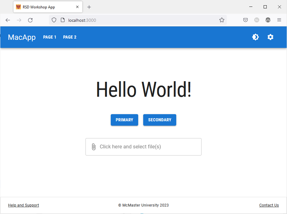
Notice the following changes:
- The “Hello World!” text now uses the
h1style defined intheme.ts. - Buttons on the main page as well as in the navigation bar now use the
buttontypography style defined intheme.ts.
Update page_1/page.tsx
Open the app/page_1/page.tsx file and import the MUI Typography component:
import Typography from '@mui/material/Typography'
Delete the line containing the <h1> tag inside the Box component and replace it with the following line of code:
<Typography variant="h1">Page 1</Typography>
The “Page 1” title text will be updated as shown below:
Using h1 tag | Using Typogrpahy component (h1 variant) |
|---|---|
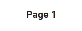 | 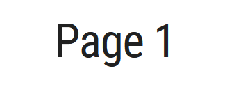 |
Update page_2/page.tsx
Repeat the process above for “Page 2”. Add the following import statement:
import Typography from '@mui/material/Typography'
Delete the line containing the <h1> tag inside the Box component and replace it with the following line of code:
<Typography variant="h1">Page 2</Typography>
Update support/page.tsx
Add the following import statement:
import Typography from '@mui/material/Typography'
Delete the line containing the <h1> tag inside the Box component and replace it with the following line of code:
<Typography variant="h1">Help and Support</Typography>
Update settings/page.tsx
Add the following import statement:
import Typography from '@mui/material/Typography'
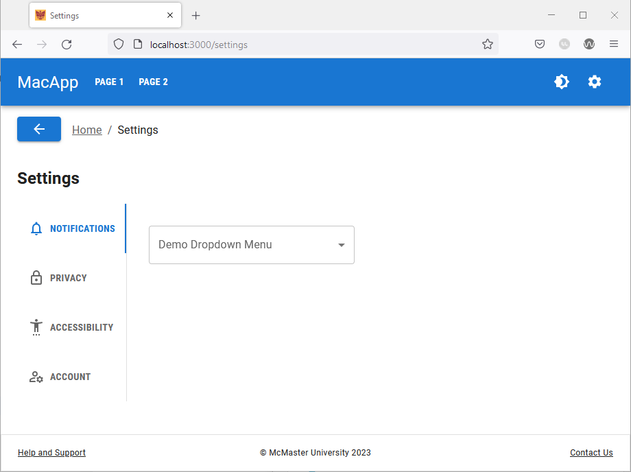
Delete the line containing the <h2> tag after the Breadcrumbs component and replace it with the following line of code:
<Typography
	sx={{display: 'flex', justifyContent: 'center'}}
	variant="h2"
	gutterBottom>
	Settings
</Typography>
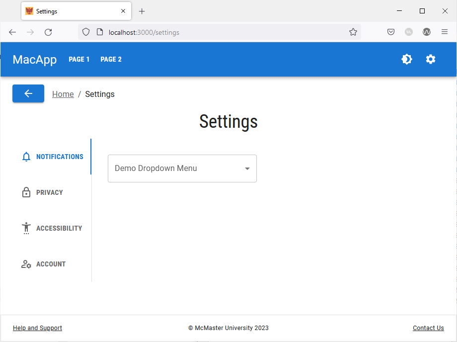
We used the sx prop to center the “Settings” title and we used the gutterBottom prop to add a bottom margin to the title.
Following these changes, the “Settings” page should now look like this:
You can use any of the typography styles defined in theme.ts by specifying the variant in the Typography component. You can also define additional styles and use them in your SPA.